It made a splash some years ago when the so-called millennial pink, a dusty, rose shade, beloved of the then twenty and thirty somethings, seemed to be everywhere. Then, this summer’s Barbie ramped it up into a bubblegum hue.
But, as we move into 2024, the pink which coats our walls is likely to be a more muted shade.

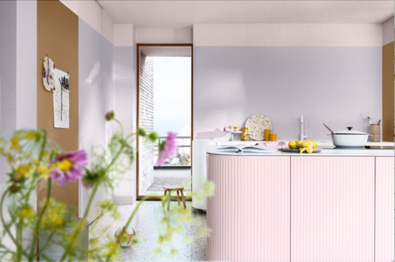
Indeed Dulux has picked a “friendly pastel pink”, called Sweet Embrace as its Colour of the Year for 2024.
This time around, it’s about the comfort a warm tone can bring.
Actor Armie Hammer resurfaces as host of celebrity podcast
Heart-stopping Halloween terror: 13 of cinema’s greatest jump scares
Doctor Odyssey’s core message: just imagine Pacey from Dawson’s Creek holding you tight and saying, ‘Shhh, it’s okay’
Conor Niland’s The Racket nominated for William Hill Sports Book of the Year
“Pinks are really having their moment, and if any colour could give a home a hug, it’s this one. Warm and delicate, it adds sweetness to a decorative scheme without being saccharine, making a room feel comfortable and welcoming. Used on its own or in combination with a host of other shades, it perfectly encapsulates that timeless truism, home sweet home,” says Jane Witter, colour consultant with the paint maker.

Use with another pink from Dulux, such as Pink Sandstone, or an earth tone like Copper Glow to create a warm colour palette, a good backdrop for natural materials such as clay, terracotta and wood. Sweet Embrace can also be used alongside soft blues/purples such as Lilac Skies, to bring some playfulness to a kitchen. You’ll pay from €59.99 for 2.5 litres of the paint in diamond matt, and it is also available in a range of other finishes.
Irish paint maker Colourtrend is also in the pink, identifying the shade as “one of the most popular within the fashion and interiors world”.

While it acknowledges that many people might find the thought of a bright, hot pink in their home “overwhelming”, the paint maker says that in dusty and muted shades, the colour is an “undeniable mood booster”. It can be used to inject some colour into a space, and if you’re no ready to commit to a full room painted in pink, it can be used on a feature wall, a kitchen island or a front door for a more subtle pop of colour.
Its range of pink paints, which includes Pink Chocolate, Chestnut Pink and Dairy Parlour, start at €35 a litre.
“Nurturing”
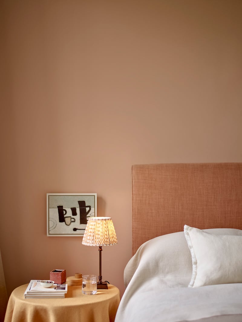
As another option, lifestyle brand Neptune has just launched a new shade of pink, Potter’s Pink, which, it says, is “inspired by the natural pigment of clay and the distinctive look of raw plaster”.

Again, the brand trumpets the “nurturing” effect of soft pink, and says it works as a “natural partner” for dark timbers and organic textures such as linen and sheepskin.

If you want something a bit stronger then the brand’s Rhubarb, is a “spirited coral”, that evolves to a deeper shade of warm rose as daylight ebbs.
Neptune’s Potter’s Pink is priced at €85 for 2.5l eggshell.


