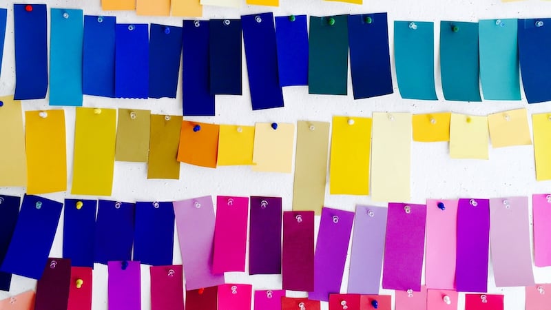
Have you ever been simply knocked sideways by a colour? In these grey winter days, it could be a splash of a red dress in a sea of black, or perhaps it’s a blue that pops out of a painting in a gallery, or a shaft of golden sunlight picking up a vivid green as the sky turns purple overhead.
Colour can make you lyrical, but it's not all sweetness and light. There are colour wars raging today, and stepping back in time, as Victoria Finlay does in her engaging book Colour: Travels Through the Paintbox, you can discover, as she writes, "more corruption, poisonings, wars and politics than even the Medicis could have appreciated". She goes on to describe "killer wallpapers, capital punishment for people using the wrong dyes, and beautiful blue stones which murder the lungs of those who find them".
Colour is exciting. The most famous example of that killer wallpaper is said to have belonged to Napoleon – or, more accurately, it was on the walls of the house to which he was exiled on St Helena. The chemist Carl Wilhelm Scheele had created a wonderful green using copper and arsenic, and soon Scheele’s Green was all the rage for lush wallpaper designs. In the damp humidity of St Helena, Napoleon died slowly from interior design.

But lovers of green in the home shouldn’t worry. Pantone has just announced its colour of the year for 2017 is Greenery (ref 15-0343 if you want to order it from Fleetwood). It’s been chosen for being able to “revive, restore and renew”.
Obsessive
Artists and scientists can become obsessive about colour. One reason is that we see the world through light, and creating paints is a process of trying to replicate that luminous alchemy. Turner, whose watercolours go on display every January at the National Gallery of Ireland – a highlight of the winter calendar – was in love with so-called fugitive colours, paints notorious for fading, and he used them indiscriminately. Ruskin remarked that “no picture of Turner’s is seen in perfection a month after it is painted”. Turner didn’t care; if he could see what was in his mind’s eye, on canvas or paper, just for a moment or two, it was enough for him. His once-red skies are now tinted with indigo as the paints have mutated. When colour maker William Winsor, of Winsor and Newton fame, took him to task, Turner simply replied: “Your business, Winsor, is to make colours. Mine is to use them.”
Colours in art can also describe what was valuable at the time. The Virgin Mary, associated for us with her blue cloak, wore red in Russian icons and purple in ancient Byzantium. But when the spice routes opened up new worlds to late 13th-century Italian artists, they discovered ultramarine, made from grinding pure lapis lazuli direct from Afghanistan. It became the most expensive colour on the market, and they reserved it for Mary. Pope Pius V later standardised this, putting Afghan rocks into liturgical law.
It’s not just bright blue stones that go to make marvellous colours. At the Harvard Art Museums in the US, a collection of 2,500 pigment samples comes from some peculiar origins. Indian Yellow was made from the urine of cows who ate nothing but mango leaves;, a practice that was discontinued, as it wasn’t kind to the cows. Mummy Brown was created from ground-up Egyptian mummies – the Pre-Raphaelite painter Edward Burne-Jones was said to have buried his tube with ceremonial honours when he found out it was powdered people.
The name Mummy Brown is an obvious clue, but other colour names also give hints about the world around us. There are some tribal languages with no word for green, while, in Irish, glas describes natural green, and uaine artificial, even if they appear exactly the same. Take this a step further and look at contemporary paint charts.
You can lose yourself in names designed to be both evocative and aspirational, such as Farrow & Ball’s Slipper Satin, Estate Eggshell, Mole’s Breath, Nancy’s Blushes, Middleton Pink (which may not have existed before Kate) and Rectory Red – though I’m not sure I could happily relax in a room highlighted with accents of Savage Ground.
Happily, unless you’re the artist Anish Kapoor, we can all use the latest colour to hit the paintbox. Called, simply, PINK, it is said to be the world’s pinkest pink, and was created by Stuart Semple (£3.99 at stuartsemple.com). Semple was disappointed when it was announced that the world’s blackest black (Vantablack), would exclusively be available to Kapoor, who developed it in association with Surrey NanoSystems. Describing the move by his fellow artist as “mean-spirited”, he set about making a colour for himself – and (almost) everybody else.
Go online to buy PINK and you find the agreement: “By adding this product to your cart you confirm that you are not Anish Kapoor, you are in no way affiliated to Anish Kapoor, you are not purchasing this item on behalf of Anish Kapoor or an associate of Anish Kapoor . . .”
There’s a 16th-century proverb that runs “when all candles be out, all cats be grey”. It’s a way of saying that beauty fades, and that we’re all the same after dark, but it’s also a good way of describing how depression, or simply having the blues, can pull the colour from your world. Focusing on colour is said to be a good start to reminding yourself of the more joyful moments, and as we come towards Christmas, we’ll be seeing lots more red, in the form of Santa Claus. But wait: Santa as a big jolly white-bearded man in a red coat? That came from Coca-Cola.


