Architect John Feely is a very moderate man. He believes that design should be restrained and wanted the owners of this naturally elegant house in Dublin 6 to enjoy all it had to offer.
When they called him, the owners did all their living in the good rooms at hall level of this two-storey over basement period redbrick. The room to the front of the house is where the family spend their evenings, John says.
“It gets the most gorgeous evening sun and is most pleasant to be in. The kitchen was situated in the back room with a cast-iron staircase outside leading down into the garden.”


They wanted to take the kitchen down to garden level to make the most of what Feely calls one of the property’s best assets, its aspect. It gets morning, afternoon and evening sun.
“By moving the kitchen downstairs it freed up the house opening it up in an unconventional way,” John says.
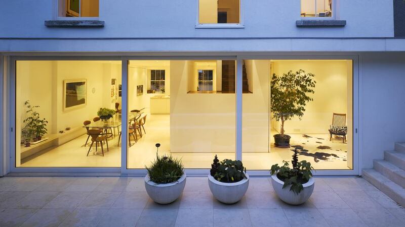
Now the kitchen cum dining room cum den is one big continuous space with the same height ceiling plane throughout so you can see all the way through the house into the back garden. All the steel support beams are recessed.
The kitchen is deliberately orientated towards the garden which has been designed by Dublin-based landscape designer and greensman to the film industry Bernard Hickie.
An island unit, positioned parallel to the front windows, means that you face the architectural foliage when cooking and prepping meals. A wall of storage, hidden behind full-length sliding doors keeps clutter from view. The hob and above and below counter units on the opposite side are hidden behind a thick dividing wall. “While the kitchen feels very pared back there is in fact tons of storage,” Feely says.
In the dining area a simple glass-topped table is surrounded by mid-century chairs by American designer George Nelson including two carvers nicknamed the pretzel chairs because of their shape.
Made of walnut they complement the new staircase that leads upstairs. Full height door openings draw the eye up and simplify the look of the space creating clean vertical lines.
Hidden from view is the den, a room that overlooks the garden and is home to a thriving weeping fig tree, an indoor plant that is not easy to keep.
It could be very simply decorated with white lights for Christmas.
The floors on the entire level are Turkish limestone. It is honed and continues outside to the patio where it is also used in the steps, planters and seating. A limestone bench runs the length of the room, offering an alternative place for people to perch and position things including some well-tended potted plants.
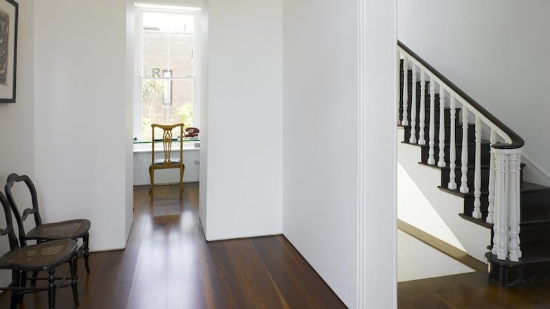
A walnut staircase leads up to hall level. A framed double-height opening is a feature of the stairwell and allows light to stream into the upper hall. It also conceals the staircase.
Supported from below, it is a bit like dentistry, Feely says. “It looks deceptively simple but is difficult to execute. By extracting all ancillary lines I’ve been able to open up the whole space. The plastered walls are painted a dental white so the space feels calm, clean and uncluttered. It’s meant to be subtle.”
My work is all about restraint, he continues. “I don’t need to show off. My palette is simple.”
In contrast the green southern hemisphere planting recalls the strong architectural shapes of painter Henri Rousseau's work The Dream, Hickie's point of reference.
To create his evergreen tapestry he used hardy exotics from New Zealand including lancewood, used by the Maori to make their spears. Hickie likes its snakeskin-like bark and deep green colour.
The garden has a narrow contemplation pool, a barbecue area and steps that double as more seating.
The owners deliberately decided against having a TV downstairs. Instead they congregate upstairs in a room where the property’s original features have been allowed to do all the talking.
It is simply furnished with polished walnut flooring. Select works on the walls add subtle washes of colour.
The study has a floor-to-ceiling opening with a sliding door to close the room off when working but which when open allows light to pour into the hall. Its deep entrance conceals shelving and a cloakroom.
Although it doesn’t look it the house has lots of cupboard space, Feely says. “It’s incredibly comfortable because it is tidy and functional. Put simply it works. It is restrained.
“I was careful about opening up a 19th century house to make it chime with 21st century living whilst remaining respectful of its origins.”


