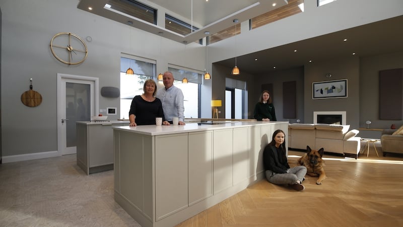
Co Wicklow residents Joyce and Jonathan Kirwan were just about to embark on a big extension and refurbishment of their family home, when their plans took a dramatic turn.
They'd been working with the architects, builders and interior designer Tonya Douglas from Little House Design for months on their plans and vision for upgrading the family home, when they spotted a house in The Burnaby in Greystones, which stole their hearts and flipped all of the plans for their Newcastle home on their head.
“The house was one of two built by a local builder, who got caught in the recession and never managed to finish it internally, so he was effectively selling a shell. But we could see the potential and the location was just too hard to pass up as all our kids, Sean, Jenni and Abi are in school nearby, and the area is quite private and quaint, yet it’s right beside Greystones village, where I’m from originally,” says Joyce.
The light-filled four-bed house was designed by local Greystones architect Colum O’Brion, and centres around a Frank Lloyd Wright-inspired floating roof.
“He went to painstaking detail to catch the light; to lend proportion and scale; to invite the garden into the house and create a cohesive living space outside with a terrace and courtyard. We were lucky the house was built with energy efficiency and every modern amenity in mind, yet it still exudes a certain character influenced by the Arts and Crafts/Art Deco eras.” says Jonathan.
The shell however still needed to be fitted out and Douglas was called in again to work her magic, “I knew the Kirwans’ style as I had been working on their original plans for their home in Newcastle, so when they got the keys to The Burnaby property in January 2018, we had a massive head start.”

The layout
The first element to be addressed was configuring the layout of the downstairs which had no dividing walls. “They wanted the kitchen/living/dining area to be the epicentre of the home - a space where they could all be together, yet at the same time, they wanted to be able to close off zones if the dogs needed to be put away, or the kids or parents needed some separate space.
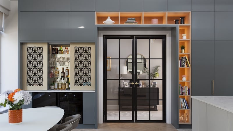
“We opted for these huge crittall-style doors to separate the kitchen from the kids’ den, the grown-up area and a spot for the dogs. They divide the space seamlessly by keeping the open-plan feeling and allow light to flow throughout. However, buyer beware as making the doors nearly drove the joiners insane. [The Kirwans commissioned joiners who’ve worked with Jonathan on his retail fit outs as he owns ice cream chain Gino Gellato.] In fact every joiner or window maker I meet says they’ll never make crittall-style doors again, they are so tricky to get right. We framed many of the doors with bookshelves or wrapped cabinetry around them, so they knit in nicely with the interiors and I think the end result was worth the effort as they tick all the function boxes and look really good too.” says Douglas.
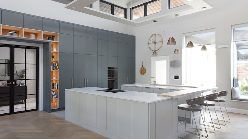
A similar version of the show-stopping kitchen - which encompasses high walls of flush cupboards, electrics and hidden workspace to one side and two islands bridged by a counter to the other - was spotted by the Kirwans in Noel Dempsey's Rathnew showroom. "We felt that David and Noel [from Noel Dempsey Design] understood exactly what our requirements were and collectively we worked on several options until we got the design that worked in the room," says Jonathan.

“One of the most fun parts of designing the kitchen was building a hidden cocktail bar over by the dining table. On the base we have dual wine fridges and then above the counter, we fashioned these stunning laser-cut sliding doors, that when closed look like a lighting design feature as they’re lit from within, but then slide open to reveal the surprise bar when it’s time for entertaining,” says Douglas.
The floating roof posed a problem for lighting as there was nowhere to suspend pendants or spotlights. “We got around it by fashioning an open square of our wood and then suspended that above the two islands and wired pendants and spots into that instead.”

Absorbing noise
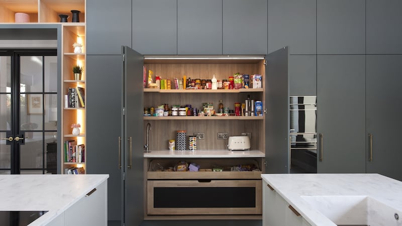
In fact the floating roof and height of the rooms in general, with some walls nearly 9m (29.5ft) high posed many issue for Douglas, particularly with acoustics. “It was as echoy as a cave originally,” says Joyce, so clever design intervention was needed and came cleverly disguised as kitchen presses. Within the floor-to-ceiling kitchen cupboards, many of the higher sections are not presses, but rather heavily padded acoustic sound-absorbing panels that blend into the cabinetry.
Douglas added many more soft touches around the open-plan space to absorb the sound, from upholstered window seats to rugs, couches and cushions. "Curtains would have been a great noise buffer but the Kirwans were reluctant to use them in this space as they felt they wold interrupt the clean lines, so we installed automated semi-opaque blinds, made by McAlisters of Newry, as a comprise," Says Douglas.

The stone and earthy colour palette and parquet flooring is consistent throughout the ground floor and the rest of the house, as are the well-thought-out design details. In the master bedroom, a floating wall provides a backdrop to ambient lighting and a large recessed headboard, made by Upstairs Downstairs in Enniskillen, but it also conceals a large open-plan wardrobe and dressing area behind it. The children's bedrooms all have sloping roofs to one side and big floor-to-ceiling windows that open up onto balconies with views out to sea.
The entire refurbishment only took six months and the Kirwans moved in last summer.
“This is definitely our forever home, we are so happy here - the difference having so much open space and light makes is amazing. It’s still a work in progress and now we are nearly there with the interior, we’re going to focus on the outside. In our last home we used to BBQ all year round, so we are working on a creating a cooking area outside that can continue that tradition, all we need now is some sunshine,” says Joyce.


