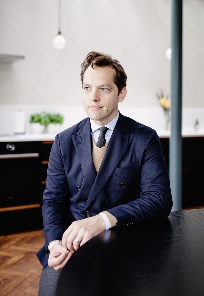
When the owners of this Dublin 6 Edwardian hired Ryan Kennihan, of Ryan W Kennihan Architects, to renovate their home he came back with a hand-drawn sketch of a simple curved shape.
“I really did not like it,” says the owner, a former TV producer who worked on several home building programmes. “I like straight lines. I don’t like curves.” She had admired his work and hadn’t seen anything like it. “I wasn’t sure why he wasn’t giving me another iteration of what he had done before.”
In contrast, her husband, a mechanical engineer, loved the exposed steel and barrel-vaulted elements that Kennihan suggested.
It was against my instinct but I liked his conviction, she admits, adding pragmatically, “we needed more space.”
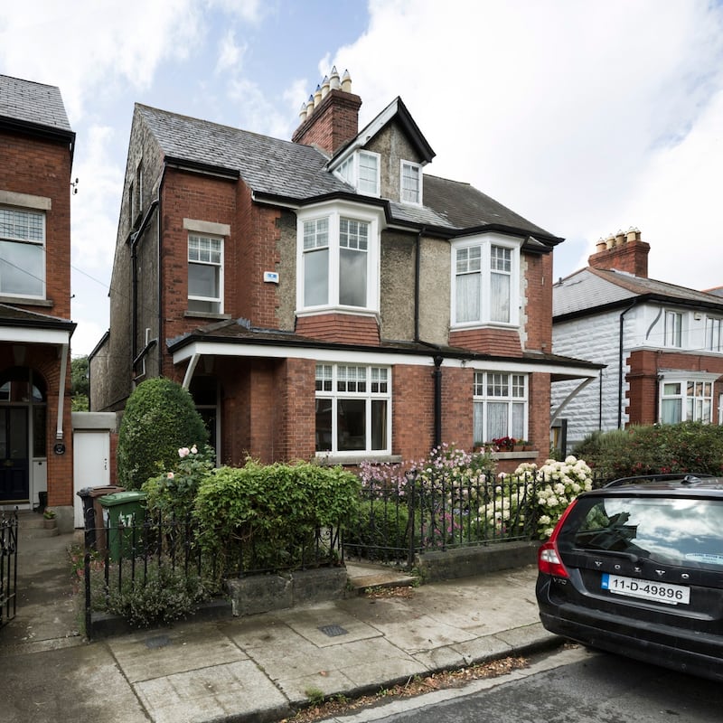
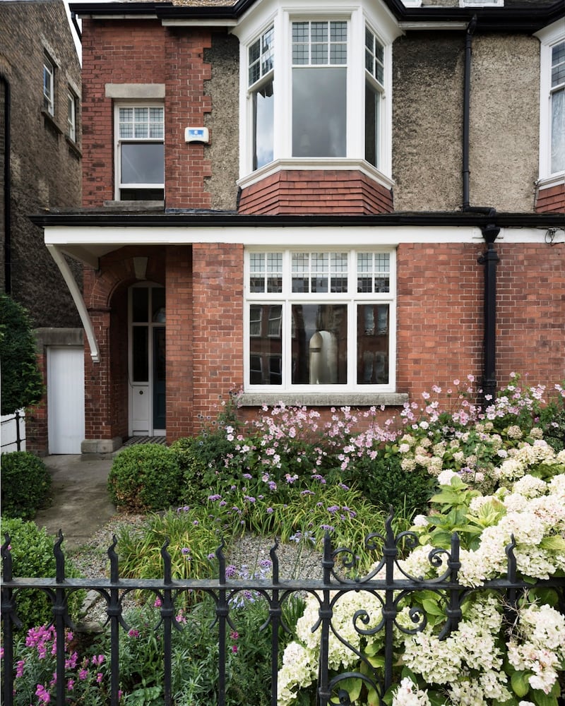
Before engaging Ryan the family had considered moving and spent about two years looking at other options. Anything significantly better was so much more costly and they decided little they were seeing was an improvement on their location, garden aspect or neighbours.
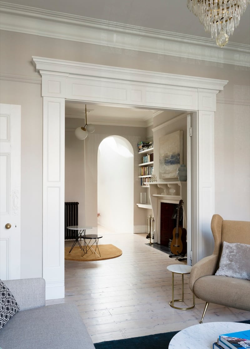
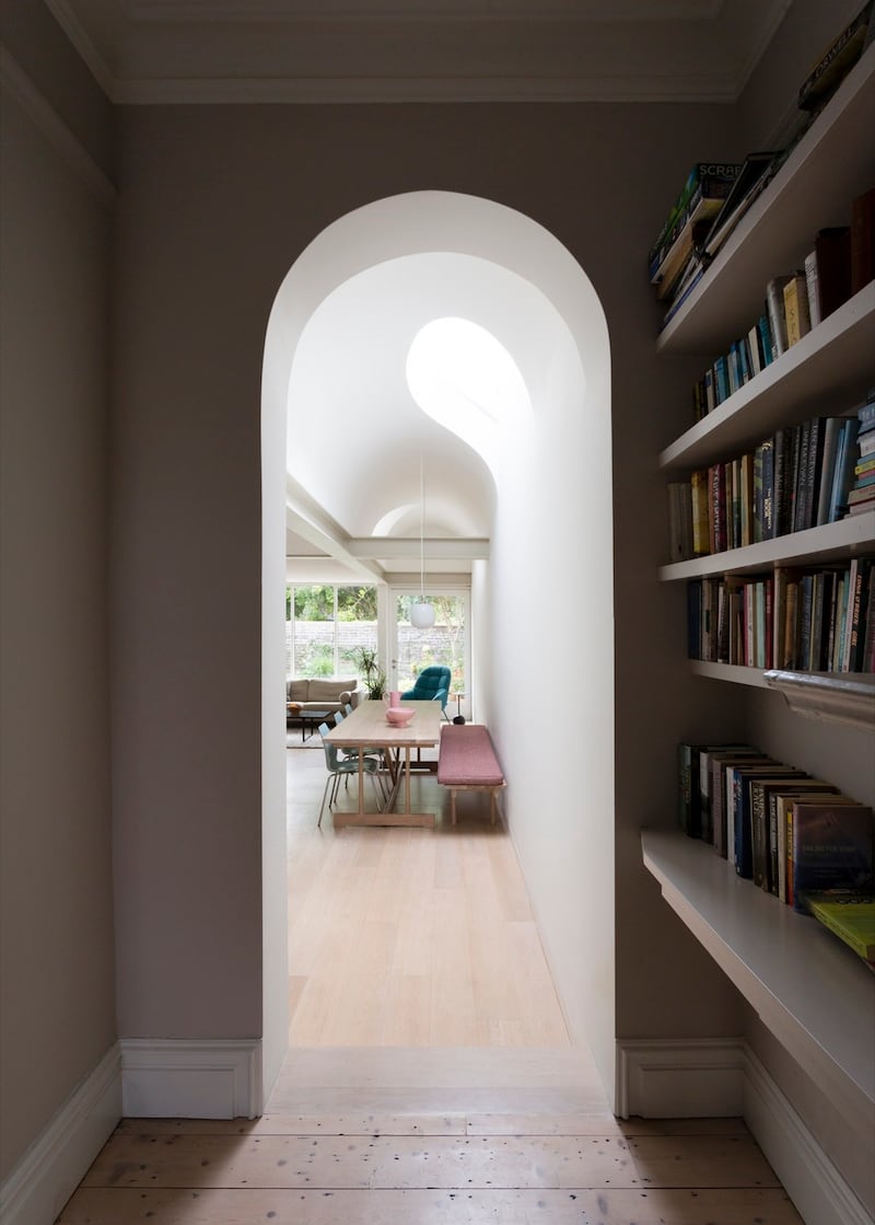
Kennihan suggested that the new extension, which filled in the space to the side of the return to the rear, could echo one of the property’s original features, an arch in the hall, a soft curve that itself is repeated at the entrance to the hall return.
He opened up the dining room, creating an entrance to the kitchen from the window to the rear. This opening is arched to reflect the hall arch and barrel-vaulted with two rooflights, one of which Kennihan describes as a stretched oval, or a half elipse, bringing light into an area that would otherwise be very dark.
The second, situated on the other side of the vault, creates a semi circle of light, with a Newgrange, oculus-effect, that moves across the wall as the day progresses. “It means the room is animated by light,” Ryan says. “You could watch the light travel across the room over the course of the day. It is very theatrical in a very peaceful way.”
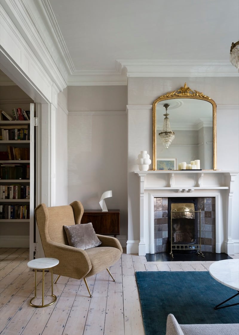
Given the curves involved the builder, BSG Homes, did an immaculate job.
The ceiling height in much of the kitchen is just above the standard 2.4m but the arch allows it to jump up to 3.5m high.
The kitchen walls are painted a soft white, Cornforth White by Farrow and Ball, the whitest shade of pale grey that works extremely well in period properties.
The bespoke kitchen cabinetry was made by Brendan Kavanagh Kitchens. Finished in a matt lacquer the doors have been edged in solid oak and the lime wash gives the units a soft, light feel. The decision to use a white stain on the oak takes the yellow hue out of the wood, Ryan explains. The handleless doors have chamfered edges that give shadow gap lines and a crafted appearance.
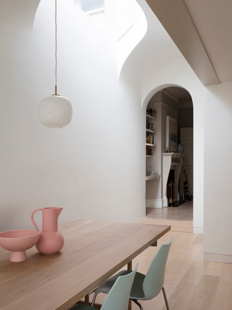
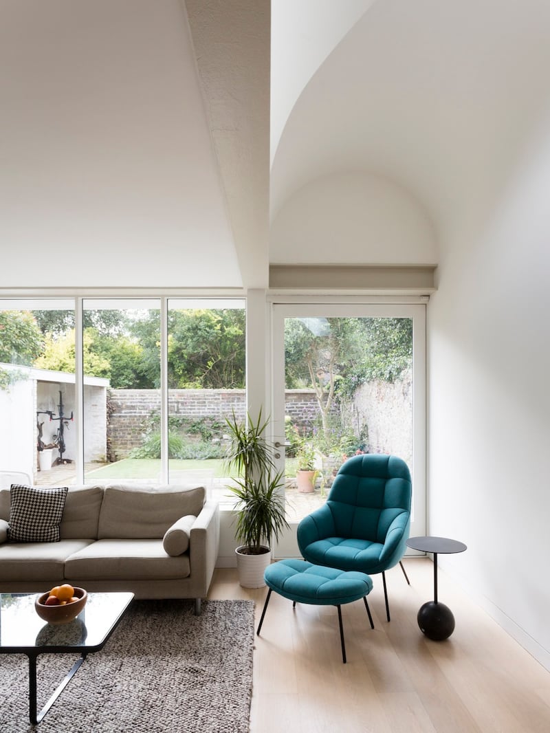
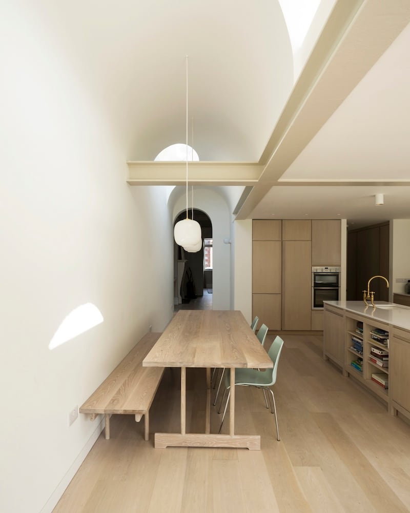
Twenty millimetre-thick Silestone counters top it off while a Devol brass tap makes a statement on the island’s ceramic sink. On its end are built-in bookshelves with hinged doors that slide back into the units, revealing and concealing the TV. A Radiohus pendant by Louis Poulsen hangs above the dining table and bench, which were made by Alan Meredith. It, the sofa, and much of the contemporary furniture came from Nordic Elements.
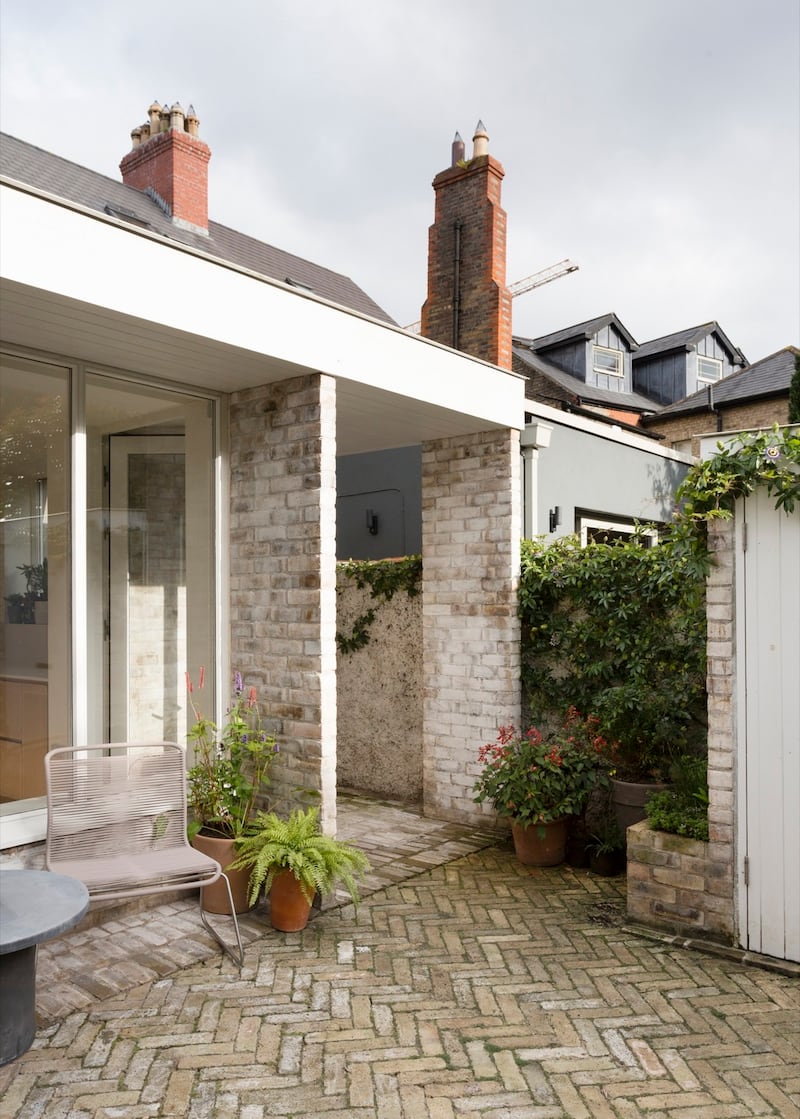
The painted timber double-glazing by Fitzpatrick Henry has a chamfered edge that makes it appear more slender than it actually is, another optical illusion, this one borrowed from the Georgian and Victorian periods. Although technically the house is Edwardian a lot of its character is Victorian in style. These vertical lines to the back of the house echo the lines to the front so that one has a conversation, if you will, with the other, Ryan says.

“The back is a contemporary reworking of what was there before. I always try to have the back and front in harmony, so that there isn’t a drastic break and they’re not fighting with each other.”
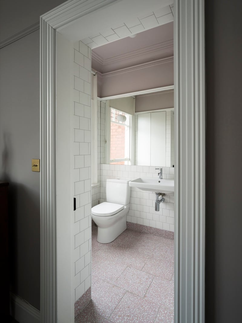
Upstairs, the en suite bathroom to the main bedroom has cornicing that lines up with that of the original part of the property. The mirror is set at picture rail level to align new with old and its large format helps to make it look and feel bigger than it actually is.
The patio is paved in salvaged Dolphin’s Barn yellow brick, which is also used on the rear elevation.


