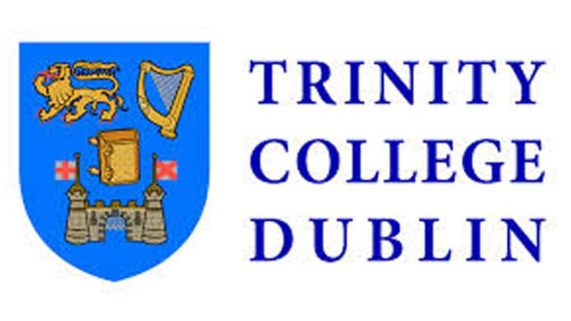
This is the time of year when the careful reader takes a deep breath before getting annoyed about any apparently absurd news story. It does, however, seem that this chatter about rebranding Trinity College Dublin was no sort of April fool.
The folk who write the amusing TV series W1A – much concerned with barmy corporate speak at the BBC – could hardly have devised better pastiches. The institution is to be renamed Trinity College, the University of Dublin, thereby ensuring that no loaded Iowan postgraduate confuses it with a refrigerator repair college (or whatever). The blue and gold colour scheme on the shield will be altered as it is considered too similar to that used by economy brands such as Ryanair, Ikea and Maxol. Most controversially, an image of the Bible on the college crest is to be replaced by a non-specific open book. It could be anything. It could be the Koran. It could be Immanuel Kant's Critique of Pure Reason . It could be Katie Price's Perfect Ponies . Let's not be exclusive here. According to a memo issued to the college board, the change would "signify our tradition of scholarship, which should be accessible to all".
It requires only a little pondering to detect a flaw in the reasoning. The notion is that, as a symbol of the Christian religion, the Bible might repel potential students from other faiths and annoy those who have no faith at all. This seems more than a little fantastic. We no longer believe in griffins or dragons, but no sane person campaigns for the removal of such beasts from existing heraldic designs. They are relics of the era in which the images were conceived. Anybody smart enough to get into TCD . . . Sorry, anybody smart enough to get into TCUD will surely understand that.

Dread word 'Trinity'
Can you think of another such relic? The marketing wonks may have mucked about with the name of the university but, some- what inconsistently, they have left the dread word "Trinity" entirely unmolested.
The college is not named after the character played by Carrie-Anne Moss in The Matrix . Nor is it named after the underrated 1960s art rock group that backed Brian Auger. The name is, of course, a reference to the Christian doctrine that defines God as three consubstantial entities (via a tribute to Trinity College, Cambridge). Nice one, revisionists. You've got rid of the Bible in the crest. But TCUD may as well be called My Big Christian College for Christian Christians.
We should, perhaps, be cautious about pointing this out. Branding engineers are not averse to changing the names of respected bodies in ways that both irritate and confuse. The most notorious example was, perhaps, the renaming of the British Royal Mail as Consignia in 2001.
The intention was to get away from the notion that the organisation was concerned just with delivering letters. Unfortunately, the ugly, meaningless new title offered no useful clues as to what the body now did. Did it “consign” things? To what state did it “consign” them? Within a year, the new name was itself consigned to an unmarked plot in the ossuary of rebranding catastrophes.
Blandly secular
Wheels are creaking within creative minds as you read this. Is there some blandly secular, crunchily memorable neologism that could replace "Trinity" in the college's new title? Learnorium doesn't quite work.
The BrainPlace is a little better. But even that seems too loaded with lucidity. Let’s learn from the television station Dave and the online bank Egg. Rather than a newly coined term, what we want is a familiar – though irrelevant – word that trips easily off the potential customer’s tongue. Daffodil College? Juggernaut College? As Dave and Egg have shown, we need fewer syllables and more glib jaunt- iness. I rather fancy the notion of Ketchup College, University of Dublin. We have our new crest. We have our funny name. You know where to send my €100,000.
This is all a little unfair. Branding genuinely is an art. Think of that sexy green Coca-Cola bottle. Consider the firm’s elegant “dynamic ribbon” graphic. Ponder the drink’s strange, slightly druggy name. Such creative thinking played a major part in turning a sugared water supplier into one of the world’s financial behemoths.
When, however, we look to Trinity College Dublin, we see an institution whose brand identity hangs around antiquity, tradition and a slight hint of fustiness (not remotely reflected in its stunningly up-to-date facilities and mod- ern teaching methods, I hasten to add).
Unlike Top Gear – subject of the most successful rebrand in recent marketing history – Trinity doesn't need its image to be made any sexier or more edgy. Not that it matters much. When you've been around for 400 years such tempests barely trouble the teacups. We'll have forgotten all about it when the quincentenary comes around.


