As the world gets warmer, Ireland’s climate is changing and the effects are being felt through increasing storms, floods, changing coastlines and unpredictable seasons such as this summer’s grey’s skies and lack of sunshine. Last year was both the warmest and wettest on record in the country, according to Met Éireann, while globally the world has baked for 12 consecutive months in temperatures 1.5 degrees greater than their average before the fossil fuel era, recent data shows.
How has Ireland’s climate changed in the last number of decades, and what can we expect if the world gets warmer by 1.5, two or four degrees? The following interactive graphics provided by Met Éireann, through its TRANSLATE project, allow you to explore Ireland’s current climate and what affects it; how temperatures and rainfall levels have changed from 1961 to 2020; and how the county where you live will be affected in terms of its air temperature and winter and summer precipitation rates as the world warms.
Please note these graphics are best viewed on desktop.
The following storymap gives some climate context by providing information about what affects Ireland’s climate currently.
READ MORE


Has Ireland become warmer?
Ireland has undoubtedly become warmer. Data from the 30 Year Climate Averages can be visualised in the storymap below. This data compares two consecutive 30-year periods (1961-1990 and 1991-2020) showing that annual mean air temperature has increased by approximately 0.7 degrees in Ireland. The ‘Averages’ are the mean or average values of a climate variable (like temperature) over a standard reference period. Periods of 30 years are taken following international practice, as mandated by the World Meteorological Organisation.
The maps below show the annual average temperatures in Ireland, between these two time periods mentioned above. Move the slider below to see how the temperature has changed. The map to the left of the slider shows the mean annual temperature from 1961-1990. The map to the right of the slider shows the mean annual temperature from 1991-2020. You can click on any part of the map to see the annual mean temperature for the location, or use the search tool to look up specific areas.
Is Ireland experiencing more rain?
While Ireland has become warmer, it has also become wetter on average, compared to the 1961-1990 period. The maps below are again divided into two time periods (1961 -1990 on the left of the slider tool, and 1991-2020 is shown to the right) with all precipitation measurements provided in millimetres. As you move the slider you’ll notice the biggest increases in rain are concentrated in the western part of the country. Click on any part of the map to see the annual mean precipitation for the location during the relevant time period, or use the search tool to look up specific areas.
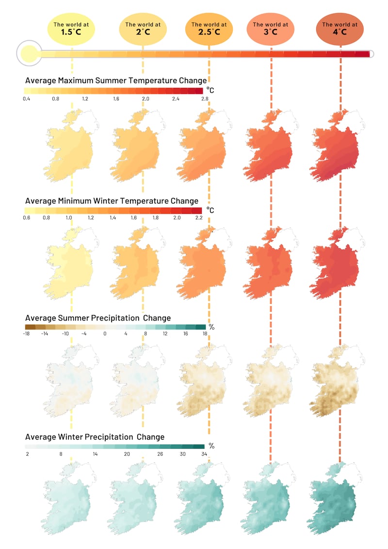
How could Ireland’s climate change as the world warms up?
Ireland’s climate is already changing, as we have already started to feel the effects of human-induced global warming. With every increment of global warming, changes in average climate occur and extreme-weather events become more frequent and pronounced. The following plot demonstrates what it would mean for Ireland if the world gets warmer by 1.5 degrees, two degrees, 2.5 degrees, three degrees or four degrees, relative to 1976 – 2005 baseline. These levels of global warming were selected following international best practice. A baseline is a reference period or measurement that is used as a starting point when comparing the climate against future values. This 1976-2005 time period was selected as the baseline because it is the earliest historical time period available for all the climate models utilised in the TRANSLATE project.
How could my county’s climate evolve, depending on the levels of global warming?
You can use the interactive map below to see how the climate could change in your county under different degrees of global warming (from +1.5 degrees to +4 degrees). Click on your county below, or use the search bar, to explore how it may be affected at varying levels of global warming.
How to understand the information panel
A summary of change values (relative to 1976-2005) are shown below, along with ranges calculated from the 10th-90th percentile of the TRANSLATE “ensemble”. The ‘ensemble’ refers to the collection of many different climate models used, while the 10th percentile refers to the lowest potential value for the variable of interest and the 90th percentile refers to the highest potential value for that same variable: together they constitute the lower and upper points in a range.
The table that follows, for example, shows the annual mean temperature at 1.5 degrees Global Warming Level (GWL). This means that the annual mean temperature could change on average by 0.79 in this particular area if the world warms to 1.5 degrees. However, it is a range, and so the annual mean temperature could change by as little as 0.39 degrees or by as much as 1.07 degrees.
Ireland’s current climate
This short video explains Ireland’s current climate, including the warmest, coldest and wettest months and our climate records.
We’d also like to hear from you. What would you like to see from our climate coverage? Are there any topics or issues you would like The Irish Times to focus on more in the future. Let us know in the form below.
The TRANSLATE project is a Met Éireann-led initiative to optimise future climate projections for the country and develop climate services that meet the information needs of decision makers such as Government departments and bodies to help them plan accordingly for Ireland’s future. It is a collaborative effort led by climate researchers from University of Galway – Irish Centre for High End Computing (ICHEC), and University College Cork – Science Foundation Ireland Research Centre for Energy, Climate and Marine (MaREI), supported by Met Éireann climatologists.
Check the Met Éireann website for more information on Ireland’s climate projections and climate services. For queries regarding the data shown on the interactive map tools, please contact Met Éireann at NFCS@met.ie.
- Sign up for push alerts and have the best news, analysis and comment delivered directly to your phone
- Join The Irish Times on WhatsApp and stay up to date
- Listen to our Inside Politics podcast for the best political chat and analysis