Sort It Light and spaceOur plans for our homes have changed dramatically, and in the past six months in particular, people seem to be finally accepting, for one reason or another, that the home they are in now is where they are going to stay.
For some this is a relief; for others it’s a dilemma, because they had not planned it to be their family home, and find it hard to see how it can possibly be the home of their dreams.
But with the right advice, it is possible to change your situation and improve your surroundings with a solution that suits most budgets. We recently completed a project for a couple who were not long married and intended to sell their previous homes and trade up. The property market worked against them and they decided it would be best to renovate instead.

The house was a modest two-bedroom terrace, and the brief was to get the most out of the space available while maximising the amount of light getting into the house.
We planned a small extension to the rear of the house to accommodate the kitchen. The couple enjoyed their garden, which was not very large, and as the extension took up a significant amount of space the design of the outside was just as important as that of the interior.
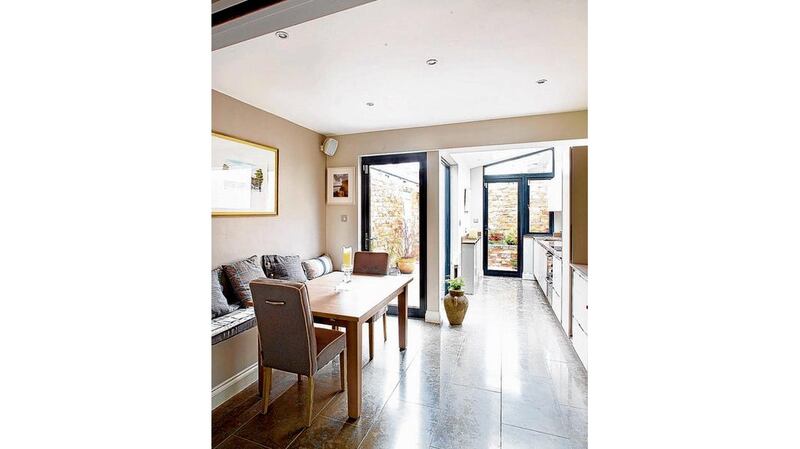
The extension was to run along one side of the house leaving space in the garden for bench seating. We ran the same floor tiles out from the kitchen into the garden which helped to give the illusion of additional space both inside and out by blurring the lines between both areas.
With any extension project, it is important to try to maximise the amount of light that gets into the centre of the house. What you want to avoid is your lovely new extension blocking light getting into the original house. With this in mind we created a void on the landing above to let light into the sittingroom from the existing Velux above. This worked well and provided a lovely feature both on the ground and first floors.
On this project we had a fixed budget to work with. We set about prioritising key areas and looking for cost-effective solutions where possible. Wardrobes were recycled and adapted to work in their new home. Existing furniture was reupholstered to work with the new colour scheme, and our client sold a significant amount of furniture and fittings to raise additional funds for the project. This is a fantastic idea and worth trying: we’ve had clients who have sold entire kitchens and bathroom suites – and one who sold their patio doors.
Space was important with this project so things like the glass sliding doors between the livingroom and kitchen gave separation without taking up space.
The bench seat in the kitchen allows for a lot of guests to be accommodated but is much more economical on floor space. And the use of a continuous colour palette throughout the ground floor gives continuity to the space and extends out to the garden, drawing the eye out as far as it can go.
Denise O’Connor is an architect and interior designer with Optimise Design


