Frank Bowling: Mappa Mundi
The West Wing Galleries, Imma, Dublin
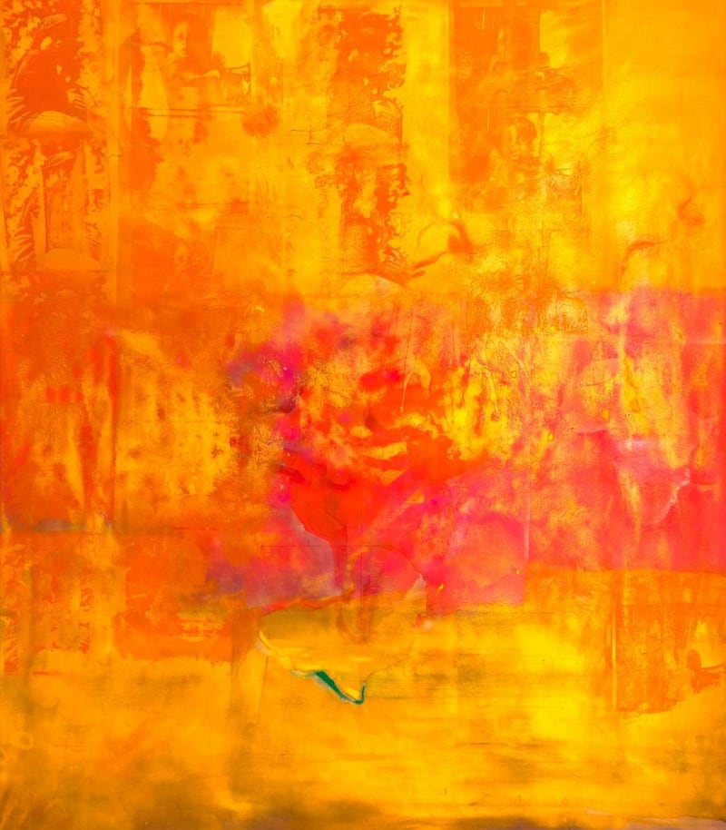
It's impossible to ignore the sheer scale of many of Frank Bowling's paintings. Australia to Africa, for example, from 1971, is in excess of 7m wide. When you are face to face with it, it's a Cinerama screen of a painting, a huge, warm, radiant, luxuriant, colour-saturated expanse, oceanic in feeling as well as in title. Yet Bowling never tries to overwhelm the viewer with scale, as some artists have done and continue to do. There's an easy, enveloping generosity to his vision. He creates vast chromatic spaces not to impress us, but for us.
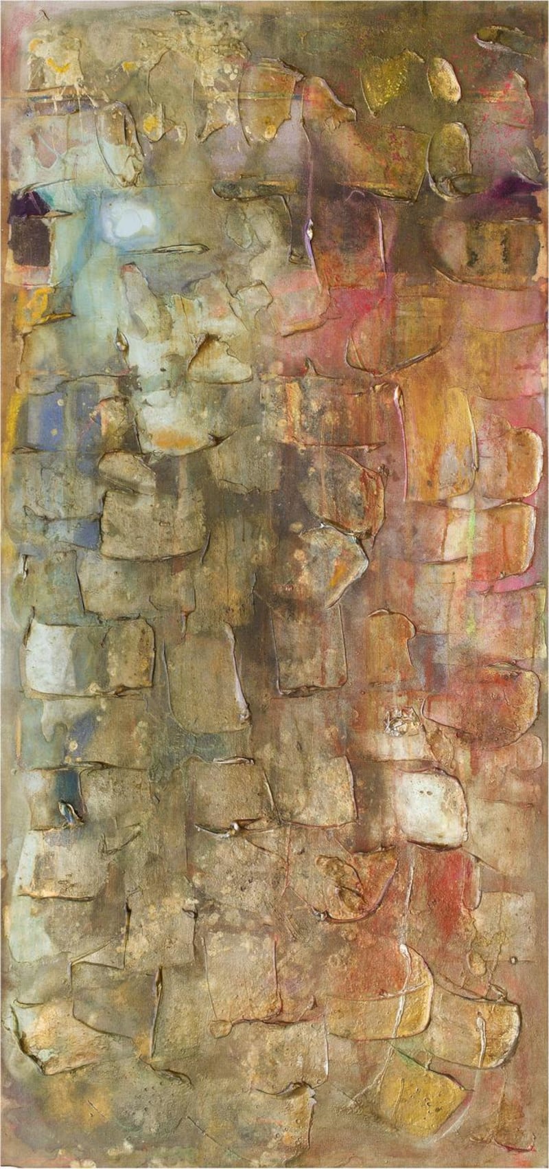
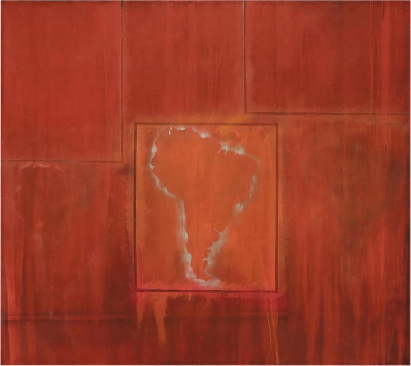
Mappa Mundi, first seen at the Haus der Kunst in Munich, is a welcome retrospective survey of his work from the late-1960s. At its heart are several of the artist's "map paintings". He began to produce these in New York around 1967 and they featured in a landmark exhibition at the Whitney in 1971. The show's other main strands are made up of series of works named after his father, Richard Sheridan, and his wife, textile artist Rachel Scott Bowling, and relating to his working and living environments, usually watery in nature: Great Thames, Bartica Flats, and Wintergreens.

Guyana was still a British colony when Bowling was born there in 1936. He grew up in the town of New Amsterdam and, influenced by the indigenous literary culture, initially aspired to become a writer. But in his late teens, feeling a little stifled, he left for London and found himself obliged to do national service in the RAF. A fellow serviceman, Keith Critchlow, had been accepted at the Royal College of Art. Through Critchlow, Bowling met other visual arts-oriented contemporaries and began to look at painting seriously, and then to paint, to the point where painting edged out writing as his primary interest.
After a brief stint at Chelsea School of Art, he got a scholarship to the RCA. It was an interesting moment, with David Hockney and RB Kitaj among his contemporaries. Hockney famously won the graduate’s gold medal and Bowling the silver, but there were complicating factors – Bowling was temporarily expelled for his relationship with a member of staff, the novelist Patricia “Paddy” Kitchen. They married and had a son together, but later divorced. The speculation is that, all things being equal, Bowling would have taken the gold. At that point he was a representational, expressionist painter, acquainted with Bacon (who turned against him, he has said) and Freud (who was helpful but lost interest when Bowling moved way from representation).

Typecast as an artist
The cultural turbulence of the mid-1960s posed problems for him. He has said that he felt typecast as a Caribbean artist who should be producing protest art. He actually did so, to some extent. It was as if his identity dictated what kind of art he was allowed to make. Not-so-subtle signs implied that, regardless of his energy and abilities, he did not belong alongside his English and European peers. It was doubly wounding, and drove him to venture across the Atlantic.
His initial arrival in New York was a reconnaissance, but from that moment he has been a transatlantic artist, with a foot on either side of the ocean. The fresh start enabled him to embrace a different kind of painting. Recognising that certain aspects of colour field painting naturally suited him, he was extraordinarily assured about just getting on with it. Staining paint into canvas laid out on the ground, he tried to keep pace with the tonal changes as the light shifted. As the pigment pooled, it looked to him like a caricature of Charles de Gaulle – abstract painters live in dread of that kind of accidental likeness. But then, when it dried, the deeper shade resembled more an outline map of South America. That seemed altogether more acceptable, and intriguing.

The map paintings were born of that moment. Once he found a bigger studio, he made larger paintings, and formalised the idea of maps by working with paper stencils. He had, in his map paintings, negotiated a useful position for himself. By no means an outsider – the influential Clement Greenberg was a friend, for example – but feeling rebuffed, in certain respects, by the mainstream artistic establishment, he had found a way of excelling in its language while alluding to his own origins and a wider, global context. He knew he was not alone in this predicament, and he wrote an outstanding, carefully argued piece for ARTnews magazine in 1971, It's Not Enough to Say "Black is Beautiful", outlining the problem.
Black art
In the piece he considered the examples of five of his contemporaries who happened to be black. Regardless of the work they produced, it was invariably labelled “black art”. His exasperation is clear, and his reasoning is faultless. It seems fair to say that Bowling’s own common-sense viewpoint is that while his work is not a way of enacting or articulating identity , neither is it a means of denying it. He is not trying to be someone else, but himself. And that self lives in and through his painting. He is a compulsively hard worker who has consistently explored the limits of what he could do. From early on his palette has alternated between radiant buoyancy and muted earthiness. Following the expansive colour fields of the map paintings, he increasingly used textural substance, gels and foams, building up surfaces of clotted, patterned masses. It hard not to associate much of this work with estuarine landscapes, muddy and vast.

Mappa Mundi is a retrospective survey, and many of the works were made more than 40 years ago, in a medium and idiom that have become to some degree critically devalued, arguably in favour of the kind of preoccupation with identity that Bowling tried to see beyond. Not least for that reason he emerges as an exemplary artist for our time.
- Until July 8th, imma.ie


