They say don’t judge a book by its cover, but a good cover does so much more than keep the pages inside intact. It attracts readers, it communicates the book’s essence. The very good ones become pieces of art in their own right. Beautiful Pictures of the Lost Homeland was lucky enough to have Anna Morrison as its designer. Here she is, in conversation with Mia Gallagher.
Mia: How did you get into designing book covers?
Anna: I’ve always loved drawing from a young age. It was the only subject I enjoyed in school. Being not very academic or sporty (in a very academic and sporty school) it was nice to have something I could throw myself into. I knew I definitely wanted to go to art college, but I wasn’t sure what I wanted to study. I completed a foundation course at Leeds College of Art and that gave me an opportunity to try out different disciplines. I realised I still loved drawing and creating images, so applied to Camberwell College of Art to do a BA in Illustration. After graduating I had to figure out a way to make some cash – London is expensive! I remembered one of my tutors saying I might like working in publishing due to my love of reading. So I contacted a few publishing art directors for a work placement and was delighted to have a bit of time at Penguin Books design department. I was hooked after experiencing the process of designing book covers, and soon after that I got a job as a junior designer at Random House.
I feel the job of a book cover designer is to translate the text to pique people's interest to pick it up to read. A cover can be literal but I think a cover is more interesting if it's ambiguous
Mia: Can you tell me about your process?
Anna: The process for designing a book cover is different, depending on the variables at play. In some cases, the manuscript isn’t in or there’s a directional brief from the editor or author to go a certain way, so you have to work within those confines. I’m most excited when it’s completely open to my interpretation and I can start with a clean slate. Obviously it’s best to have read the book – I did this with Beautiful Pictures – and from there I tend to sketch a few ideas down. This is not necessarily anything visual I’ve remembered from the text, sometimes an idea just comes through the narrative. These ideas don’t usually emerge while I’m reading, they tend to come when I’m thinking about it afterwards. I feel the job of a book cover designer is to translate the text to pique people’s interest to pick it up to read. A cover can be literal but I think a cover is more interesting if it’s ambiguous.
Once I’m happy with a set of ideas, I usually try out about four or five different approaches. I send these off to the publishers – they can give me feedback/ revisions or, if they are happy, they’ll send on to the author for their thoughts/approval.
I love working for New Island Books. They tend to publish really exciting books by Irish authors and being Irish (from Belfast), it’s fantastic to work on books from home. I feel connected with the language and the rhythms of Irish writing.
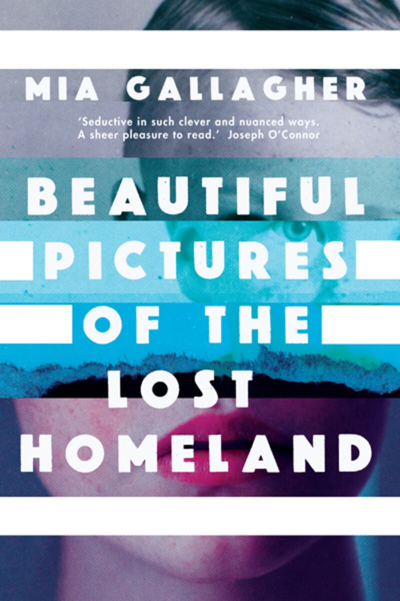
Mia: There’s something really perfect about the cover for Beautiful Pictures. I remember you sent us through five images initially. Four of them featured faces while the fifth was more abstract. What strikes me, looking at them again, is this idea of layering and collage common to them all – did you start with this in the back of your mind?
Anna: Yes! I loved Beautiful Pictures of the Lost Homeland. I have to read so many books in my job and it’s not often I love a book I’m working on this much, but I really did with Beautiful Pictures. Georgia was so complex, her psychological struggle interwoven with the grief in her life, I found it so compelling. In my design I wanted to portray both the abstract themes of her identity as well as the beautiful writing.
I had so many ideas for this book initially it was almost overwhelming; it’s such a full and rich novel! It’s vast and covers many themes and characters, often going into side stories. I felt using a collage would best represent the different layers within the novel, how it moves through time, Georgia’s past and present, and the other places and stories. I felt it worked well for this book, like pieces of a puzzle.
Mia: This is a bit like asking a lover about their old flames – but did you borrow on previous work you’d done for this book?
Anna: Ah no… Beautiful Pictures is such a unique book. These were a completely new set of ideas. Lots of people say to me when I have lots of work on “oh is there not an old visual you can use and work up with the new title?” – but I feel as most books are so different, I can’t just use an old concept.
Mia: Can you tell me about the idea of the “stripes” that became the dominant theme of the jacket we used? You used that in two of your proposals…
Anna: I thought the stripes could represent the idea of “cross over”, both Georgia’s transition and between all the different parts of the stories. They are good dividing techniques – also in one of the Maps chapters, I remember reading the line “strong lines appear”! I combined this with a motif of ragged paper edges – again just to give it a collage feel, like putting the book together as part of a puzzle.
The colour scheme was inspired by a chapter in the book that talked about super 8 film. I love that over-saturated colour that you get with super 8 film; also, it has a kind of looking into the past, vintage photograph, memory feel.
The pattern of lines on the spine came from the fifth original idea I sent in – the one without a face in it. This was a more abstract idea of the novel as a whole journey; it uses cartographical/topographical lines and references the Maps Cycle in the Wunderkammer.
MG: And how did you find the composite face that makes up Georgie on the cover?
The two faces are from Shutterstock (online photolibrary). I did look for a trans image, but most stock imagery is pretty straightforward unless you have a specific image in mind or have the money in the budget for a particular photographer. I didn’t want to show a full face, so I chose to leave it quite ambiguous – just a hint of Georgie/Georgia.
Anna Morrison is a UK-based freelance art director, designer and sometime illustrator. She works mainly in publishing, designing book covers for a variety of clients in Britain and internationally. annamorrison.com