
Our humble daily weather forecast map often unwittingly reveals more than we realise. Look beyond tomorrow’s outlook for rain or sunshine, look again at the map that is used, the places named, the places not named, the borders shown or not shown.
We tend to take for granted the map we see every day simply because we have grown used to seeing it over time. So the political geography of a nation’s weather maps rarely invites local comment or attracts attention.
RTÉ uses a map of the whole island of Ireland. There is no Border. Its sunshine and cloud symbols rarely extend to Britain even though the latter is occasionally visible on screen. The BBC shows Britain and Ireland, including the Border; it almost always includes Belfast when showing the names of UK cities, never shows Dublin, and rarely extends the sunshine or cloud symbols south of the Border. Sky News shows temperature boxes across both the UK and the Republic of Ireland but omits them from continental Europe. Both show weather fronts across continental Europe but do not show temperature boxes for any nearby French, Belgian or Dutch cities.
Met Éireann’s recent Storm Emma status-red weather map for the whole of the Republic of Ireland was perhaps an exception. Northern Ireland was conspicuously omitted. Unlike TV stations, national metrological offices have international jurisdictional responsibilities. That Met Éireann’s maps follow national borders, “amputating the northeast of Ireland”, is a cause of great frustration, according to the Sinn Féin senator Niall Ó Donnghaile.


Whether deliberate or indifferent, the cartographic omissions or inclusions in daily weather maps across the world can be strikingly revealing. Israeli weather forecasts are a case in point.
In Yedioth Ahronoth, Israel's largest daily newspaper, no Palestinian cities in the West Bank (apart from the mixed city of Jerusalem) are shown on the weather map. Their omission, one could argue, is reasonable, as these Palestinian cities are technically not inside "Israel proper", nor have they been officially annexed by the Israeli state.
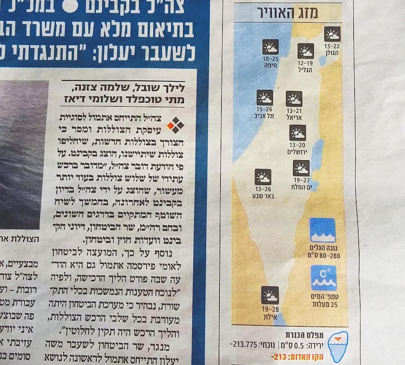
The same, however, is also true of the Israeli settlement city of Ariel, whose residents are citizens of Israel.
Ariel is 15km from the Palestinian city of Nablus. The population of Nablus, at 120,000, is six times greater than that of Ariel, at 18,000. Nablus is also invisible on weather maps on Kan 11, an Israeli public channel. Similarly, Channel 10's nightly forecast and weather maps in Israel Hayom, Israel's largest free newspaper, show Ariel but no Palestinian cities except Jerusalem.
The Green Line – the border established by the 1949 armistice, which separates “Israel proper” from the occupied West Bank – is also missing from all these weather maps. They in no way distinguish Israel from the West Bank.
It is simpler to define Israel’s eastern border by drawing a relatively straight line from Golan Heights, in the north, to the Red Sea, in the south, than to re-create from memory the contours of the Green Line. In Israeli geography schoolbooks that border appears and disappears, apparently at random, from page to page. For the most part the West Bank border is invisible.

This simpler version of Israel is sometimes referred to as Eretz – Greater Israel, essentially. This is an Israel that views the Green Line as nothing more than a temporary man-made border. It is the preferred map of not just weather forecasts but of the Israeli right.
Those who identify themselves as being on the mainstream left, who seek an end to the Israeli occupation and who favour a two-state solution, have traditionally preferred to draw a very different Israeli map. This map excludes the West Bank. This is an Israel that adheres to the 1949 armistice line as informing the Israeli border with a future Palestinian state.
The occupation of the West Bank entered its 50th year in 2017. It has now existed for almost three-quarters of Israel's existence
To draw this map of Israel is to deliberately withdraw from the occupied territories. It is as if, at the stroke of a pen, the map maker liberates all Israeli-occupied West Bank.
The reality is that there is and has been, since 1967, only one state between the River Jordan and the Mediterranean Sea; that state is Israel, and it currently denies 2.8 million Palestinians in the West Bank the right to vote in the state in which they live.
A new left perspective is beginning to use that obvious fact to employ the one-state “Greater” Israeli map to advance a call for a single state with universal suffrage across all of Israel-Palestine.
Ironically, as such a narrative gains momentum – “one man-one vote” – the radical neo-Zionist right requires the pretence of resurrecting the Green Line as a veil to disguise both the existing reality and their long-term aspiration of a single Jewish state – without Palestinian voting rights – between the Jordan and the Mediterranean.
What was once understood as a left-wing map is now criticised as right-wing, and what was once a historical right-wing map has now become weaponised as a tool for the left.
The Israeli occupation of the West Bank entered its 50th year in 2017. The occupation – a linguistic term long infused with an intangible temporality – has now existed for almost three-quarters of Israel’s 70-year existence.
If we view the occupation neither as a temporary aberration nor as a semi-detached extension of “Israel proper” but as an integral part of a permanent norm, then a map of Israel that excludes the West Bank is somewhat dishonest, delusional or both.
Any political desire to reinstate the 1949 border to facilitate the creation of two states should not be confused with the responsibility of map makers today to call it as it is. Aspirational geography should not be substituted for territorial reality. We cannot subcontract our present-day geography for a virtuous or virtual mental map of an unknown future.
It seems that the 50-year occupation is reinforcing not just its normality but, ironically, its invisibility
A generation of Israelis who are retiring today were still in school when the occupation began, in 1967.They have spent their working lives in an occupying Israeli state. It is not surprising that their children and grandchildren should view the occupation not as a temporary arrangement but as a fixed geographic and political reality.
Whether in weather maps, in high-school geography books, or on government websites, singular maps of Israel that include all of Israel-Palestine, devoid of the Green Line, are everywhere.
Perhaps it’s no surprise that a recent study found two in five Israelis aged 18 to 29 believed Israel had already annexed the West Bank, presumably in the knowledge that Palestinians in the West Bank can’t vote in the Israeli parliament. It seems that the 50-year occupation is reinforcing not just its normality but, ironically, its invisibility.
This article is adapted from Seamless Neighbourhood: Redrawing the City of Israel, by Paul Kearns and Motti Ruimy, published by Gandon Editions; redrawingproject.com/2015/01/14/the-seamless-neighbourhood/


