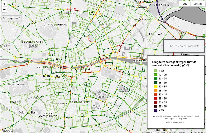
Details of air pollution levels on every street and outside homes across Dublin city are available for the first time following a 16-month air quality study by Dublin City Council and Google.
The “hyperlocal” study, Project Air View, captured more than 50 million air quality measurements at 5 million locations around the city using an electric Google Street View car equipped with mobile air sensing technology.
The huge number of measurements allowed the production of detailed maps identifying the precise locations of poor, or good, air quality in the city, which will be used by the council to develop environmental, climate and planning policies.

The interactive maps indicate good air quality in most areas, but with noticeable exceptions such as the Liffey Quays, Doyle’s Corner in Phibsborough, and busy approach roads to the city where pollution is significantly worse than on surrounding streets, with elevated levels of harmful nitrogen dioxide (NO²) detected.
Before the study, air pollution was measured at some 26 static stations in the city, which gave a picture of the quality for those locations on a constant basis – but not fine-grain local data of every road in an area, according to principal environmental health officer with the council, Martin Fitzpatrick.
“The Air View car went down every street in the city a minimum of six times, a median 14 times, and in some locations 30 times and more. We already have an air-quality monitoring network with our colleagues in the EPA [Environmental Protection Agency] at 26 different locations across the city, monitoring day and night, 365 days a year.
“What we’re doing with Google is not trying to supplant or replace that. It complements and gives different insight into the same picture, but at street level – your own road, your own corner, so you can see exactly what’s happening. It’s giving a level of detail we haven’t really seen before.”
The project measured the levels of six pollutants: particulate matter (PM 2.5), nitric oxide (NO), nitrogen dioxide (NO²), carbon monoxide (CO), carbon dioxide (CO²) and ozone (O³) in the air.
However, initially the maps provide details of just two of these pollutants, NO² and PM 2.5, as these are “the pollutants of the greatest significance”, Mr Fitzpatrick said.
“In cities, NO² is typically associated with traffic, so the map will show that on busy roads, but we are also seeing higher levels of NO² in residential areas we might not necessarily expect. This allows us to see if it is an issue outside a particular school or other location, and plan accordingly.”
PM 2.5, consisting of fine particles, has a number of sources, including solid fuel heating, traffic and construction sites.
[ Dublin among top 10 cities for air quality, study findsOpens in new window ]
“One emission source that shows up on the map is, where we have large development sites, we see spots along those roads with elevated PM 2.5. With our colleagues in the planning department we are putting very strict restrictions on the housekeeping on construction sites.”
This can involve measures to screen sites, vehicle management and wheel washing.
Speaking at an event to publicise the project, Minister of State for Public Expenditure and Reform, Ossian Smyth, said the maps brought visibility to an invisible killer.
One in five deaths in Ireland is caused by air pollution, he said. “The problem now is, though smog has mostly been dealt with, smoking indoors has been dealt with, the air pollution around us now is invisible; that’s the important thing about this project – it brings visibility,” he said.
“You can now say ‘this is where the pollution is on my street, this is where I drop my children off in the morning’. If the Government wants to come back to people and say ‘I think for the sake of your health and your children’s health we should restrict dropping off children here’, this will allow us to get public support.”
The map is available at Google’s Environmental Insights Explorer. To use the map scroll down the screen to Air Quality and click on Explore air quality data link. The left hand side of the map allows users to select either nitrogen dioxide or particulate matter, while the + and – buttons allow the user to zoom in on areas of interest.


