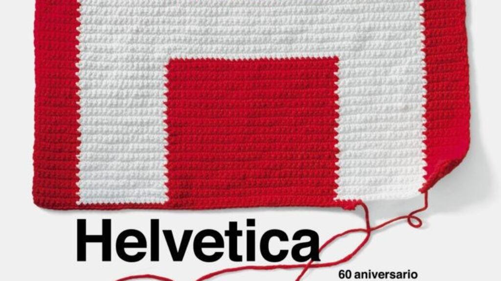
The Helvetica typeface turns 60 this year – a fact something only typography students might mark were it not for its ubiquity. Simply put, its how we have come to navigate the modern world. The letters are simple, geometric, easy to read – little wonder it became the go-to typeface for a seemingly never-ending list of global brands from BMW to North Face and beyond.
There’s no peering at it, wondering if there that’s an “s” or an “n” as there can be in decorative scripts with their curly descenders and uneven appearance, which is why it is used so often as the type for transport, from the London Underground to Lufthansa.
From its invention – or rather its arrival in the US after 1960 – Madison Avenue advertising agencies adopted it with gusto – used in logos, it shook off the past with its clean utilitarian modernism. Its sans-serif simplicity has encouraged its use on digital media – Twitter uses a version, Helvetica Neue, for the same reason, publishers don’t want you to waste a nano-second trying to decipher a letter.
Its origins are Swiss – which from the start helped give it a clean neutral image. It was designed in 1957 by Max Miedinger and Eduard Hoffmann at the Haas Type Foundry in Switzerland. The brief was to design a competitor to the then popular Akzidenz Grotesk typeface, one that would have no intrinsic meaning and which would be used on a range of signage. It was originally only available in light and medium, with italic and bold coming later. Its original name, Neue Haas Grotesk, was changed in 1960 to Helvetica – a version of Helvetia, the Latin name for Switzerland.
In the documentary Helvetica (there have been books too and a Museum of Modern Art New York exhibition devoted to the typeface), contributors debate all aspect of the typeface – not least its political meaning. Some consider it the quintessential capitalist typeface because it used by so many corporations; others consider it socialist as it is so ubiquitous and accessible.
For a look at how modern designers see it, check http://60helvetica.com/ a project, curated by Spanish studio Husmee to mark the 60th birthday with posters from 20 designers using the typeface.


