[ read the interactive iMag versionOpens in new window ]
THE PRINCESS OF PRINT
FRIEDA GORMLEY - House of Hackney
When former Topshop buyer, Dubliner Frieda Gormley, founded House of Hackney with her partner Javvy M Royle, a product and graphic designer, four years ago they couldn't have dreamed that one day they'd be asked to collaborate with the William Morris Gallery to re-imagine
some of England's best loved designs by the interiors punk of the late 19th Century, as Gormley describes him. She sees lots of similarities between House of Hackney and what Morris and Co was about."An egalitarian designer, he rebelled against the aesthetic of his time to create something that wasn't just for the elite. As one of the very first shops to use price points, he advocated that design should be both beautiful and useful and had, for the time, a very modern handwriting."

Morris and Co was, in essence, about bringing nature indoors, a thinking that House of Hackney also follows, albeit in a more is more way. The collection is a range of printed velvets that in isolation look tame enough. It is when they get the House of Hackney treatment – when print is layered atop print, on cushions, furniture, curtains and walls, that it veers into maximalist territory. When House of Hackney launched, giving pattern a maximalist reboot was a bold act of rebellion against a minimalism the couple felt had become tired and was everywhere.
While the wildlife of the Epping Forest was Morris’ inspiration, it was Gormley’s grandmother Margaret (Peg) O’Higgins’ house on Blackhorse Avenue, Dublin 7, that opened her eyes, aesthetically speaking. The modest three-bedroom property was full of antiques hand-picked by Peg.
Gormley likens her grandmother to Iris Apfel, the New York nonagenarian interior and fashion designer who is known for her signature round glasses, layers of costume jewellery and eclectic home ideas.
She had an amazing eye, recalling a house “full of leopard print, velvet, cushions and tassels”, a heady collection of decorative tropes that have gone on to form the backbone of HOH’s distinctive style. Gormley’s grandmother rode a motorbike and bequeathed her a pai r of her biker boots and a velvet patchwork quilt. That mix of texture and intense colour in diamond velvet shapes has stayed with her.
Gormley has always been an interiors enthusiast. When she bought her first house in the Tenters in Dublin 8, she was saving her pennies to buy Liberty wallpaper because “that was what made my heart beat over anything else”.
Before they set up House of Hackney the pair had lived with white walls and Scandinavian furniture. “There had been a decade of minimalism and with both of us working in creative industries we could feel trends and we were bored.”
They wanted something that felt modern but gave a nod to the past. Royle had a background in prints and she had worked as a buyer at Topshop. “We had the skills to make it happen and decided to put our money where our mouths were.” They didn’t have the money to rent a space to showcase their collection so they turned their Victorian home into a showroom. It wasn’t being PR savvy, Gormley admits. They didn’t have the budget to rent a space. Looking back, it was a brave move.
But if they were bored by pared-back minimalism, so too was the media, which went wild for the over-the-top aesthetic. The couple's germ of an idea has borne real fruit – they opened a flagship store in 2013 that was listed as the third best shop in London by Time Out magazine, which called it "the natural successor to Liberty". With room for the patterns to breathe, it gives ordinary folk a better idea of how to juxtapose the prints in real life.
Taste is just being confident in your likes and dislikes, Gormley says. “Colour, texture, print. This is our ethos.” Throw caution to the wind and throw out the rulebook is her credo.
But if you’re new to print, then mix it with neutrals. “Print wallpaper on one wall and a neutral sofa looks great.” She also also loves a white room with print accent cushions. Or suggests hanging a beautiful linen print curtain in an otherwise plain room.
Best way to instantly update your home? Invest in a great roll of wallpaper and a pair of beautiful cushions. The new printed Morris velvets give it a fresh look and feel.
TALKING TRENDS
Interiors’ buyers from some of Ireland’s top stores reveal what they’re seeing in the markets they scope and give clever tips on easy access to new trends and small changes that make the most impact.
INDUSTRIAL REVOLUTION GOES MAINSTREAM
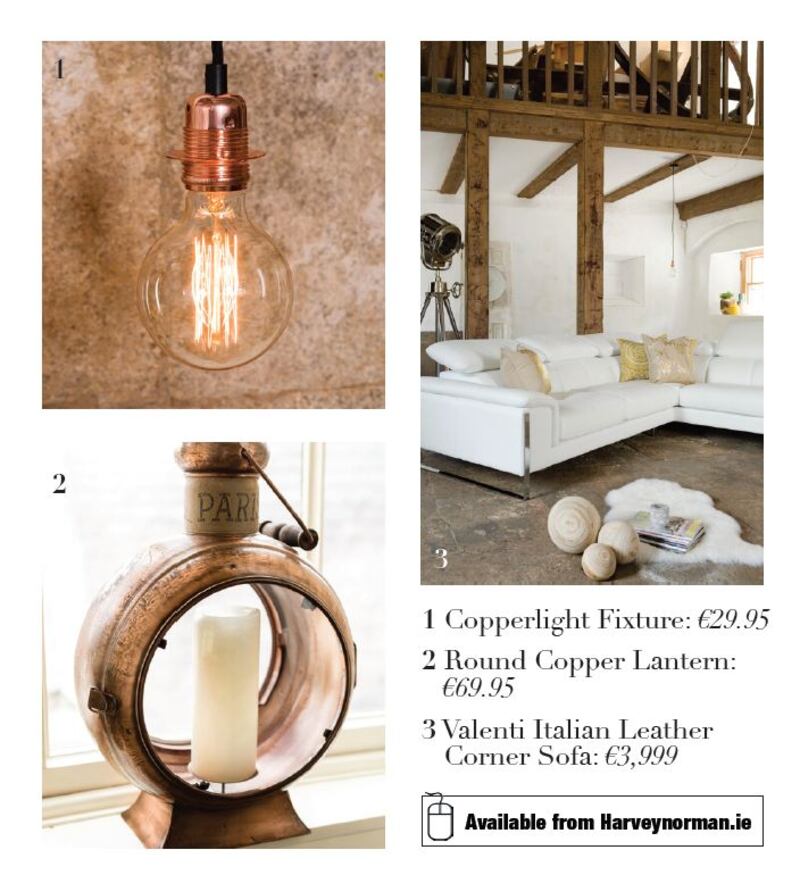
Rachel McCann at Harvey Norman spends a large part of her time travelling and is always looking for ideas that feel fresh and new. She documents everything she sees and uses the photographs she takes to create mood boards that will lead to the looks you buy. She also trawls Pinterest and uses fashion catwalk directions to help make her colour choices.

She remains a fan of loft-style living and has bought items that will work for all of us living in spaces far smaller and more confined then the industrial trend’s origins. “It’s about paring back and letting a select number of strong pieces – from distressed furniture that looks and feels like a vintage find to exposed walls. “This is a look you can achieve in the smallest space by using brick-effect wallpaper,” something she’s done in her own kitchen.
“You can build on something simple like wallpaper by layering textures. Oversize filament bulbs hung over a kitchen island will add to the mood as will certain styles of barstool. Bouchon is lacquered steel-frame style that has a cork seat. As well as being super comfortable to sit on, it is bang on trend. Cork-topped storage jars and neon and signage that lights up will update white or painted kitchen units.”
New bed linen is a simple way to modernise a sleep space. The 300-thread count cotton collection comes in fashionable and fun prints, something Irish customers are quite adventurous about. Last year, McCann went really big on the stag as a pattern, selling it with a matching trophy to hang on the wall. For autumn/winter 2015, she’s gone east for inspiration. The motif is elephants, which she started thinking about on a buying trip to Cambodia about 18 months ago.
She's also introducing a cosy Nordic mood to the bedroom with a brushed cotton collection that feels really good to sleep in and will send you straight to the land of nod. Expect to see penguins and wolf prints that can be teamed with real sheepskin rugs. Harveynorman.ie
ARCHITEXTURE
Helen James is one of the ever-increasing string of designers who have set up home at Dunnes Stores. When she launched Considered last year she gave us new and, mainly culinary-based, reasons to shop at the chain, but like Aretha Franklin sang in the 1985 hit
, Considered is coming out of the kitchen. James is extending the bakeware, textiles and food range to include more furniture and soft furnishings.
As a trained weaver she has a love of texture that she’s brought into this collection, designing storage and linen baskets that you will want to touch.
Texture is the way to soften the look and sound of a space. James has woven texture into chunky rugs that she says feel lovely to walk on barefoot. She believes laying lots of rugs underfoot is a simple way to add colour and pattern. She wear-tests everything at home, subjecting samples to the rigours of family life with three boys, before they can make it into the range. Only if the item is “still alive” after such stringent conditions does it make it into the collection, a process she affectionately calls the “son test”.
In furniture she’s designed a honed white marble-topped side table whose brass legs add warmth to the cool stone top. For the kitchen, there’s an oak dining table and bench, pieces that are made in Ireland in Castlepollard, Co Westmeath, that will work in conjunction with her Tribeca chair, a design that is inspired by the classic wishbone style by Hans Wegner, or with simple painted kitchen seats.
Terracotta ceramic serving plates and bowls have an authenticity about them because you can see from the rim that it is terracotta.
The collection features earthy, natural tones that are muted. "Simplicity is my philosophy. Each piece has to have a purpose and be beautiful to look at. Each piece has to stand alone and work in tandem with the rest of the range." dunnestores.com
SMOOTH OPERATOR
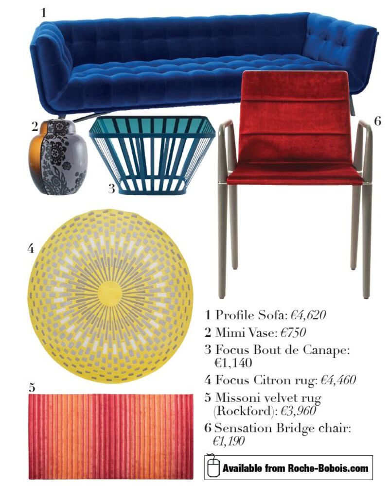
Velvet, a tactile and richly ambient fabric, adds depth to the look and feel of furniture, says Dorothy Power of Roche Bobois Ireland. For autumn/winter 2015, she has introduced a subtle ombre cotton velvet that has a slight two-tone sheen.

Used to update the Long Island 11 collection of sofas and chairs, it is available in stonewashed jewel colours: the softest amethyst pink, citrine yellow, and soft platinum grey. The Sensori velvet is extremely hard-wearing for everyday use and the upholstery features a very narrow piping detail in white that makes the shape of the seating subtly stand out.
It’s about cocooning, Power says. Velvet is an integral part of Roche Bobois’s heritage and has been used constantly in collections down through the years, from the more classical pieces in the Nouveaux Classique collection to the iconic Mah Jong seating. First designed in 1971 by Hans Hopfer, it suits the 1970s’ reprise that fashion is mining for AW15. The seating has been given numerous updates, including adding Missoni multi-coloured velvet stripe and plush Coomba velvet – a jumbo-cord looking finish – to give parts of the modular sofa a two-tone effect. Underfoot Missoni rugs have a velvet feel that feel wonderful to walk on.
Jean Paul Gaultier has reimagined his signature tartans in a velvet finish to add a sense of luxe to the Profile sofa and Ingrid chair.
In dining rooms, customers want a chair that can comfortably seat guests, Power says. The Sensation chair by Alexander Lorenz is a way to bring velvet into the dining room. Slightly padded, it encourages guest to linger at the table and is available in several colours. roche-bobois.com
A KIND OF BLUE
There is toning down of colour, says Barry Rochford of Bo Concept. "Nature is the new design focus.

It’s about bringing the outside in but framing that idea using colours that will work indoors.” So instead of a grass green, the shades are lichen and sage; while orange is the new black is a successful TV show, in the home the shade that works right now is amber and in blues the inspiration is the sea, the pale azure shades of the shallows and the deep intense marine blues of the deep. Blue is a colour that makes people smile, says Rochford.
“Trend forecasters state that blue is the new grey and several of our designers, including home concepter Christian Hasselbrinick, believe dark and moody walls to be the perfect backdrop to your squishy new sofa or bed. When the paint company Farrow and Ball introduced Stiffkey Blue, a shade inspired by the mud on beach on England’s Norfolk coastline, in 2013, it was hard to believe that grey would become unseated but we believe certain shades of blue will become as much of a platform colour as gray has been over the last 10 years. It is a stylish way to show off your art and furniture.
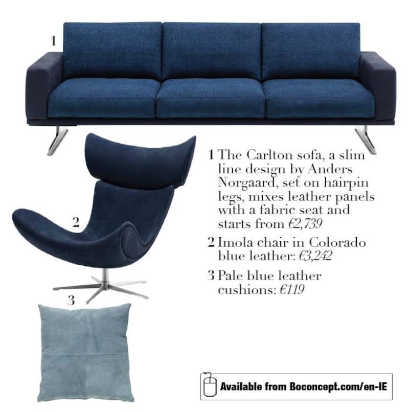
“Instead of wholeheartedly buying into the trend by painting a room blue, you could pick up the colour with select pieces, the Imola chair, for instance, by Henrik Pedersen, upholstered in Colorado blue leather with a brushed steel base, is a subtle way to bring in blue. Our Carlton sofa, a slim-line design by Anders Norgaard, set on hairpin legs, mixes leather and fabric in a way that feels fresh. Or instead add ink spots to the dining room through the lacquered legs of a Breda dining chair, by Rene Hougaard. Blue leather cushions with bring a sofa up to date or add blue underfoot floors with a Neutron or ombre Conda rug in petrol blue. Adorn walls with an abstract original oil painting or a more graphic piece of glass art.”
Add contrast with sand and copper tones. This can be introduced in fabric, leather and metal finishes. The Pine Cone pendant by Charlotte Hencke and Olaf Recht, comes in a warm copper finish that will make your blues sing. boconcept.com/en-IE


