Refurbishing a protected structure is not a project for the faint-hearted. Who knows what lies behind the walls or beneath the floors? But for Bríd and Gary Wright, the renovation of their Victorian house in Dublin’s Rathmines was almost stress-free. They put that down to the team of architects, builders, interior designers and landscapers they worked with. “They do say that teamwork equals dream work and that’s what we found,” says Gary. Several of the key team members were women, and he found this to be a refreshing change in the context of a construction project.
The couple were living in Terenure with their three teenagers when they bought the five-bedroomed house overlooking Palmerston Park in 2021. Bríd had been coming to the park with their children for years and had always admired the houses. “So when we saw this house, we were very taken with it. It has the lovely high ceilings and gorgeous proportions to the rooms,” she says. “But we did know we would have to do it up, and it would be our first doer-upper so we expected a baptism of fire.”
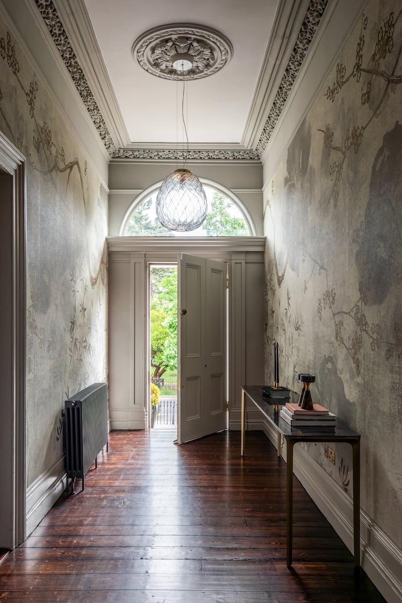
The estate agent recommended a local firm, DMVF Architects, because of their experience with conservation work. “We met Lisa McVeigh and Ethna McDermott and we teased out a number of options around what we could do with the house. We ended up being really pleased with the plans they put forward and decided to go on the journey with them,” Bríd says.
“They also challenged us along the way and sometimes said: ‘Your idea there is not right for the house’. We built a great sense of trust with them and knew that they would deliver a project that was in line with the brief for a lovely family home, that was practical for modern living.”
New homes: comprehensive guide to what’s for sale in Dublin, Wicklow, Kildare, Meath, Cork and around the State
‘They’re supposed to represent us, not sue us’: Crafts council threatens members after critical feedback
If Robert De Niro no longer feels he is able to speak out, one wonders who in the US does
The White Lotus review: Season three has its finger on the pulse to an almost excruciating degree
Almost a year since they moved in, both agree that the result is more than they could have hoped for. “The one thing we wanted to do was to keep the character of the house, the cornices, the floors, as original as possible while having a modern living area and we succeeded in that,” says Gary.
If you had said to me at the beginning of the project that I’d have a gold island, I would have said no I won’t. But I love it
— Bríd Wright
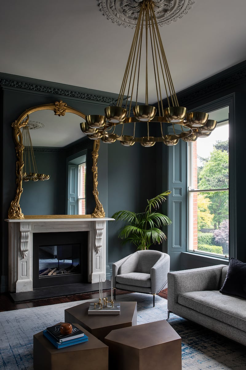
The numerous fireplaces have been restored, new life has been breathed into the stained-glass windows while contemporary paint colours and intricate wallpapers complement the home’s historical details.
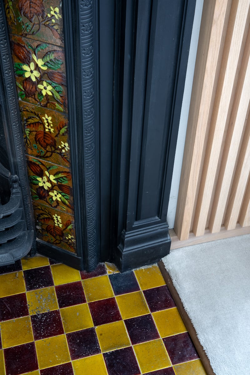
The original kitchen was one of several rooms in a dark basement, but now the space has been transformed into a light-filled kitchen and an atmospheric dining area, while a new living area looks on to the garden. There is more green space on top of the extension, which has a sedum roof. They hope it will attract bees and wildlife. “I was worried that it might be difficult to keep but it has really thrived and we are very happy with it,” Bríd says.
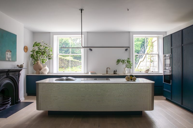
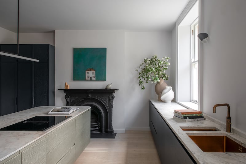
Back inside, the Wabi Sabi-designed kitchen is anchored by an island with a gold marble counter top. “If you had said to me at the beginning of the project that I’d have a gold island, I would have said, no I won’t,” says Bríd. “But I love it.”
The couple had originally planned to have the kitchen at the back of the house, overlooking the garden, but they are now relieved that they listened to the architects. “The living area is the main gathering area now, it’s a great room,” says Gary. “And the step from the dining area down into the living area defines the different rooms.”
The floor-to-ceiling glass doors lead out to the lush and leafy garden, landscaped by Nicola Haines, gold medal winner at Bloom. “It’s a space of great joy for me,” says Bríd. “I love to sit out there on the odd day when it’s not raining and have a cup of coffee.”
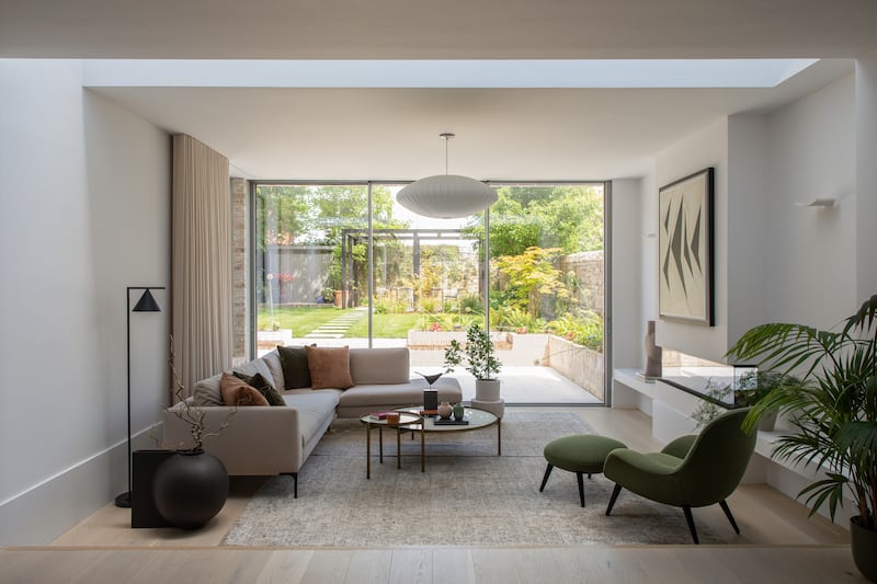
The sunken patio makes it feel like a natural extension to the house when the doors are thrown open. Mirroring the garden’s brick work and tiles in the living area adds to that feeling. “It was a very wise way to design it,” she says.
Keen to bring light into every area, she was surprised by the advice to paint the dining area and ceiling dark green, but now sees the wisdom in that. “It really defines the diningroom space and brings a nice cosiness to it. And it works so well with the brass surrounds, so that was a really good call.”
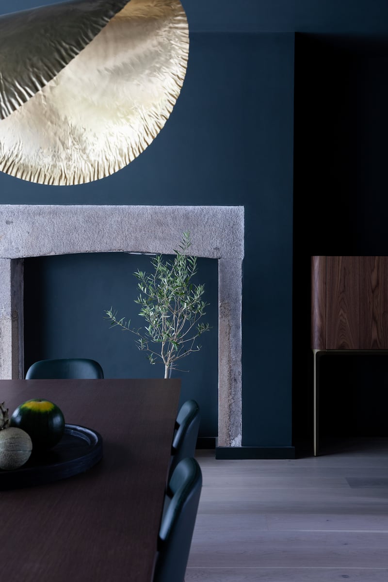
Their request for plenty of storage for the trappings of family life was addressed with clever hidden cupboards all over the home. The entire diningroom wall conceals generous storage, while no inch goes unused in the space under the stairs. “It’s a lovely way to live now, where everything has its place and it has brought a great sense of calm,” she says.
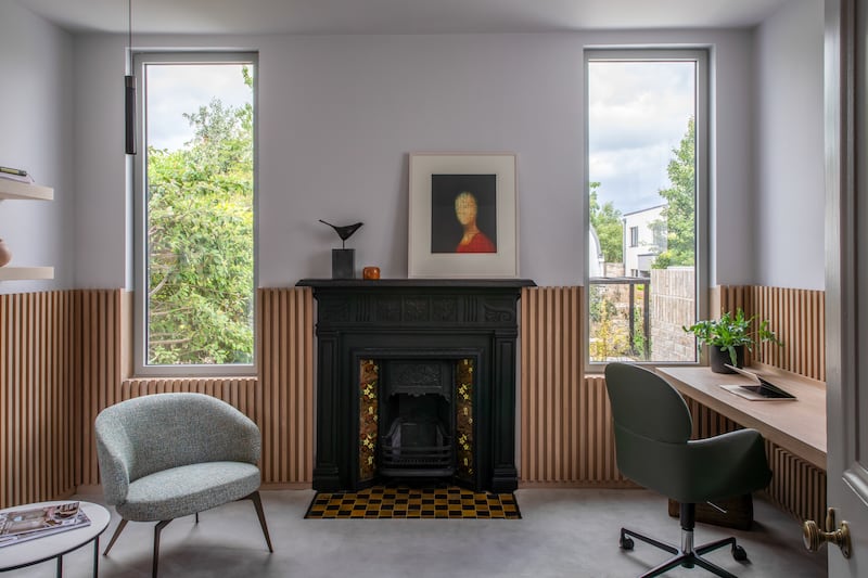
The fifth bedroom is now a home office that would be the envy of anyone working from their kitchen table. It’s a calm and inviting study, with views of the garden to bring you back down to earth when work gets stressful.
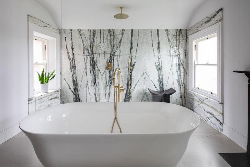
The main bathroom has light streaming in from four windows and a marble backdrop to the rainfall shower. The homeowners were particularly grateful to the tiler who had to deal with the logistics of getting the giant tiles up several flights of stairs to the top of the house.
Realising that patience is a virtue is key to tackling an old house, which needs to be treated with care and consideration
— Bríd Wright
They worked with Invent Interiors and Studio 44 Design when it came to choosing furniture, textiles and colours that would respect the home’s history. Bríd particularly appreciated how they were offered choices that suited every budget. “We could mix and match and select what we thought was right and still have that uniformity of style throughout the house.”
But back to the mammoth job of taking on a late 1800s house, and the fear of discovering nasty surprises when construction began. How did that go?
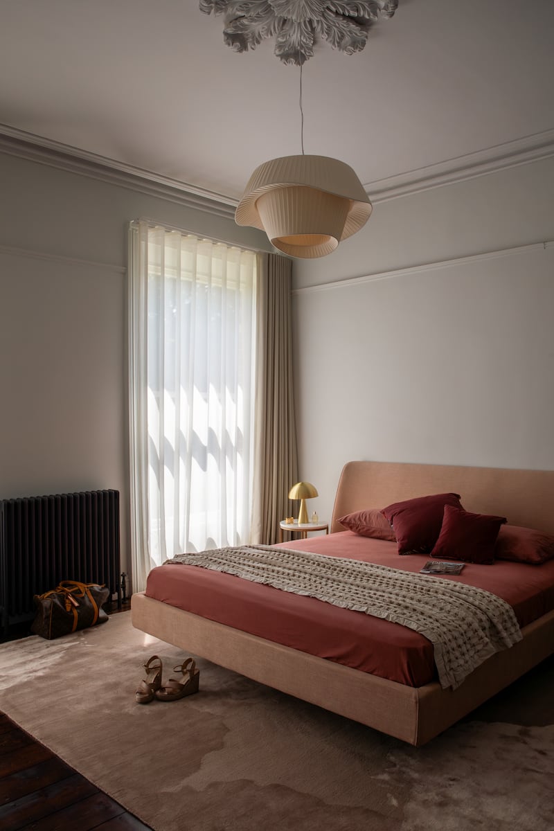
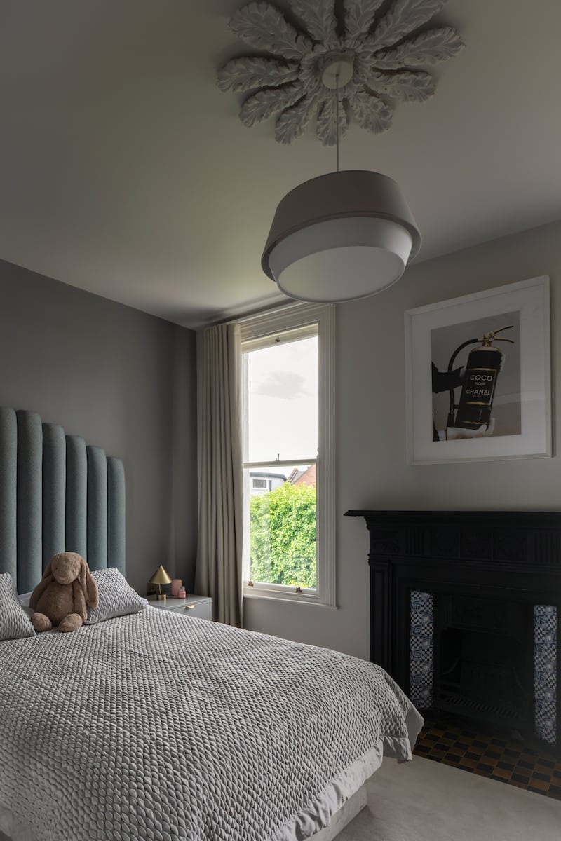
Gary says some ceilings had to be pinned to prevent sagging in the future. “And one small piece of steel had to go in, but for the size of the build they were really minor things.”
Bríd says: “Of course we did encounter issues and there were moments of stress, but what I liked was the effort made by the architect and builder to resolve the issues in the most cost-effective way.”
In hindsight, they couldn’t imagine taking on such a project without an architect with experience working on conservation projects. “They were two steps ahead of us and a step ahead of the builder all the time,” says Gary. “And they had a great contacts book when we needed someone.”
The whole experience was so positive that he wouldn’t baulk at doing another renovation. “Definitely, I enjoyed the project, and it was a good learning experience as well.”
As for Bríd? “I don’t know if I’d do it quite yet,” she laughs. “I feel we have a very happy home and I’m exceptionally content here. I don’t think you can ask for much more than that.”


The biggest win? “The garden,” says Bríd. “I love the fact that we still have the old walls and they add so much character to the garden ... it gives us a space of great joy.”
Biggest mistake? “While not a mistake, my belief that the project could be delivered quicker caused me personal frustration,” she says. “I think realising that patience is a virtue is key to tackling an old house, which needs to be treated with care and consideration.”
- Sign up for push alerts and have the best news, analysis and comment delivered directly to your phone
- Join The Irish Times on WhatsApp and stay up to date
- Listen to our Inside Politics podcast for the best political chat and analysis


