

“It’s got a bowl of sugared almonds feel to it,” says Collette Ward, sweetly conjuring up the dusky-hued kitchen of a recently redesigned Victorian terrace in London’s Primrose Hill. The house, in one of the UK capital’s chicest spots, is a fresh start for the owner, and each room exudes personality and vibrant verve, courtesy of Co Wicklow designer, Ward.
So how does that work? Can an interior designer separate themselves from their own tastes to let your own personality in, or is it more a collaboration that adds a little of you, and a little of them? As we have all learned from home renovation shows, it, of course, depends on the designer.
Having worked with the owner, who has been based in Ireland for the past 30 years, on previous projects, Ward already had an insight into her preferences, but even so, while Ward’s own style is well known for being colourful, the client’s is more whimsical and pretty.
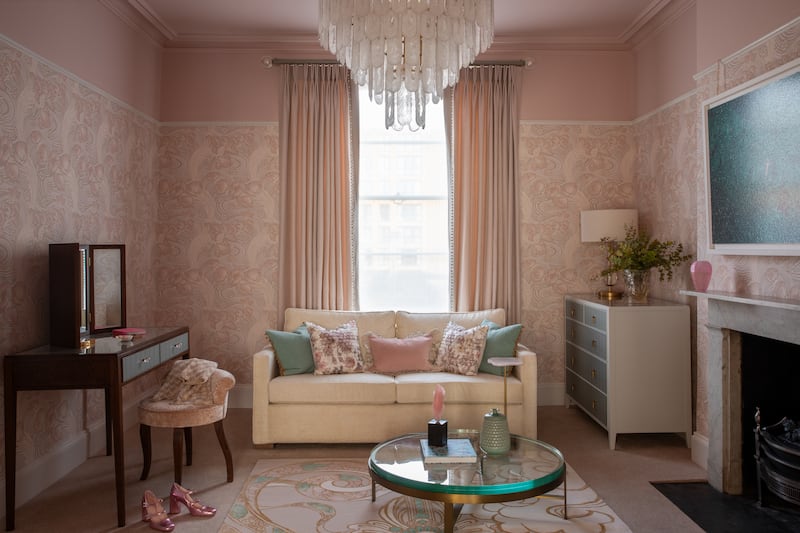
There was also the fact that, as Ward says, “She loves pink. I found this a voyage of transformation, or rather of personal development,” she says wryly. “Because I hate pink.”


Primrose Hill came to fame when the visibly cool and fabulously famous crowd including Kate Moss, Jude Law, Sadie Frost, Sienna Miller and Liam and Noel Gallagher made it their stomping ground. Known as the Primrose Hill set, they put it on the map.
It helps that the place has a village vibe with a mixture of Victorian and Georgian terraces, that the hill itself has panoramic views over Regent’s Park, and that the place is awash with designer boutiques and gastronomic watering holes. It’s a short walk along the Regent’s Canal towpath to Camden Market, just in case it wasn’t all idyllic enough already.
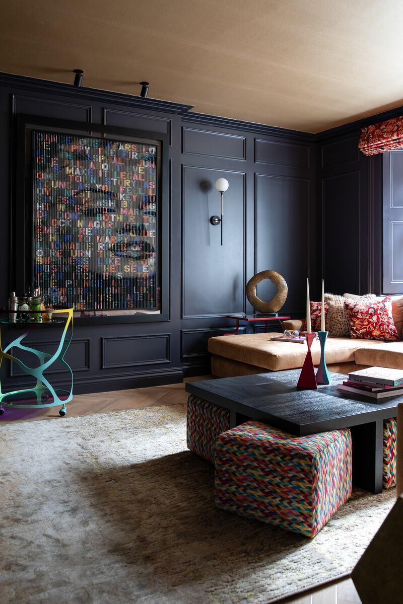
The owner had been attracted by the sense of warmth in the house, which had been a family home. But, embarking on a new chapter in life, she was in the mood for a total makeover. The results are a fun and functional house, with space for visiting family and friends, and an overall come in and have fun vibe. The expression of this range from gold papered ceilings to light shades made of chain, woven wallpapers and brilliantly brave combinations of patterns, shapes and textures.

The whole thing took about six months, and Ward, who is based in Aughrim, Co Wicklow (collettewardinteriors.ie), advises to be prepared. Despite the house having been in good order, she says that “with any period home, once you start scratching the surface, you do discover things that take more time, money and planning”.
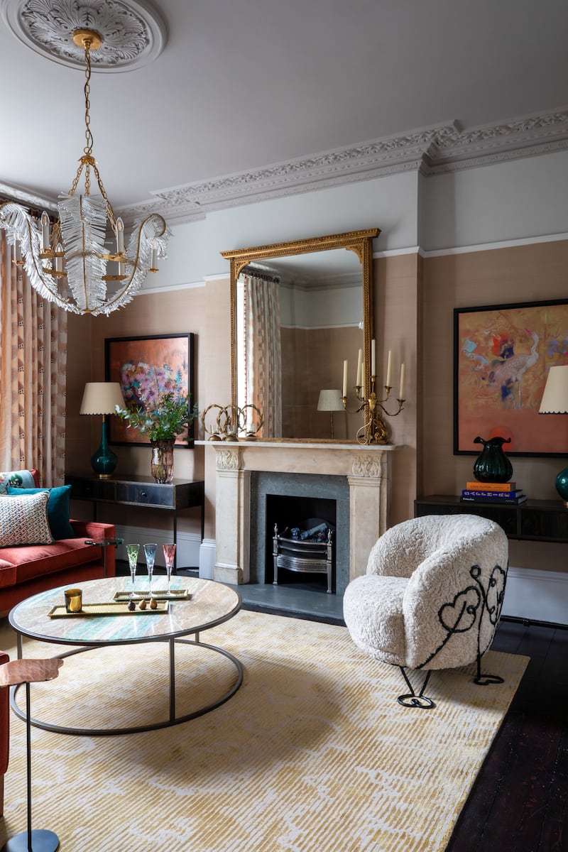
The process starts with conversations, from an understanding of the person, and the house itself. Whether your own personal taste leans to pinkness or not, there are plenty of ideas to steal here. Ward cleverly differentiates between what she describes as hardworking background rooms and “fabulous showpiece rooms”.
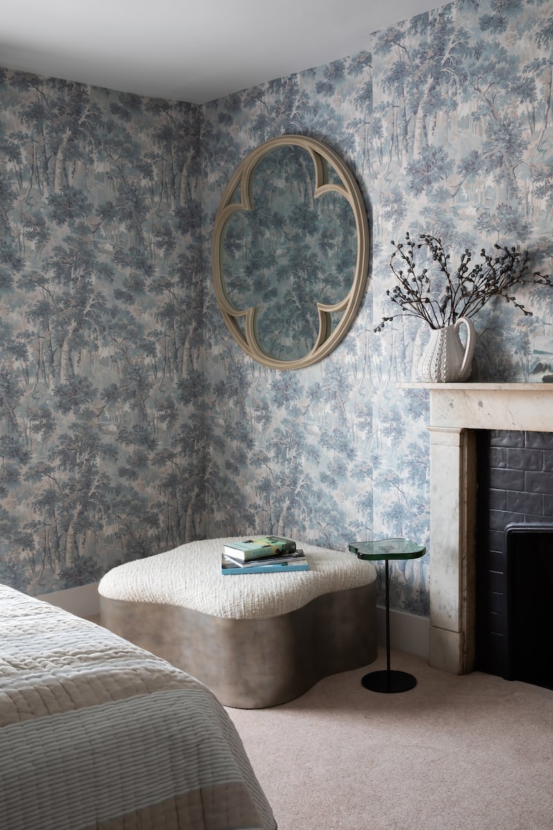
In these, the owner’s beloved pink has space to play, but accents are cleverly threaded through the entire house, to give a sense of continuity. This needs to be done with a light touch, and could be something as small as a candlestick or a detail in an artwork. You don’t have to be slavish about it either. At the house in Primrose Hill, one of the guest bedrooms is a dreamy, peaceful blue.
On the subject of that, don’t forget about your spare room(s), which run the risk of feeling “rather sad and empty” when not occupied. Even when not in regular use, you’re still spying them through the doorway, so you want to enjoy the idea of them.


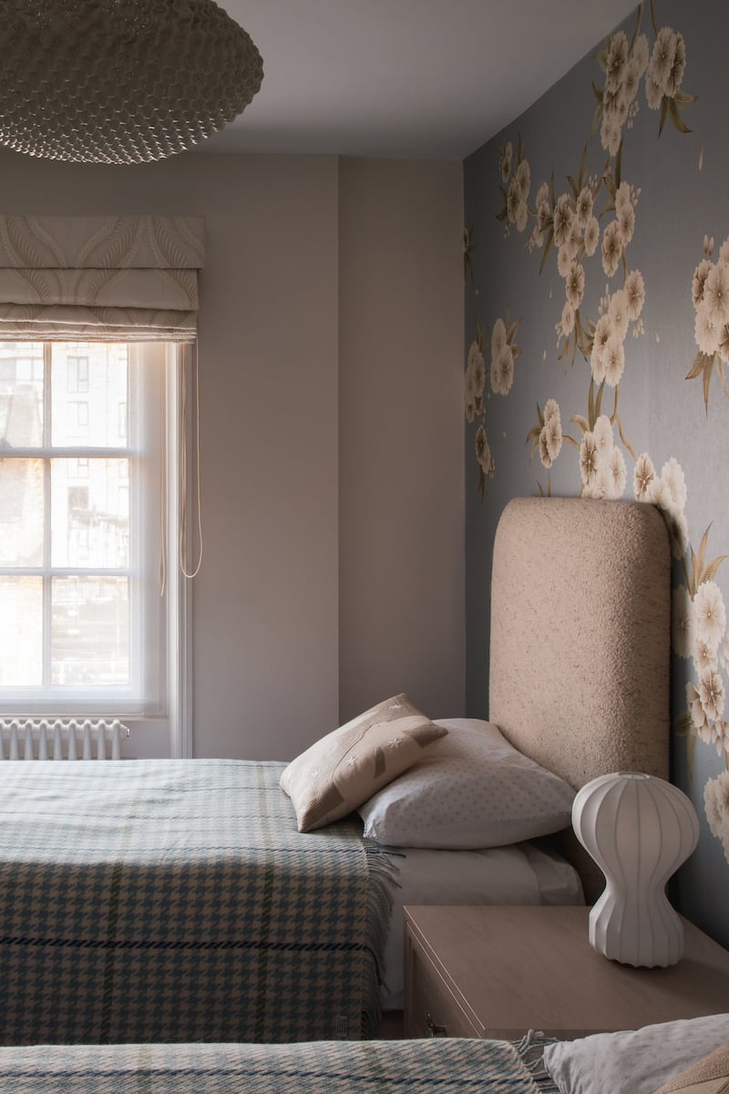
Ward has given each guest room here its own mood: alongside the blue room, there is another in soft shades of brown, cream and baby blue, and another with a bold striped wallpaper from Transylvanian maestros of the magnificent, Mind The Gap (mindtheg.com), coupled with detailed print fabrics by Manuel Canovas (manuelcanovas.com).
One of the reasons the colour works so well here is that the proportions of the rooms give it space to play. Ward has grounded it with earthier tones on some walls and with her use of linens and other textured fabrics, “so it’s not all froth”.
[ How your hallway can make a good first impression with savvy designOpens in new window ]
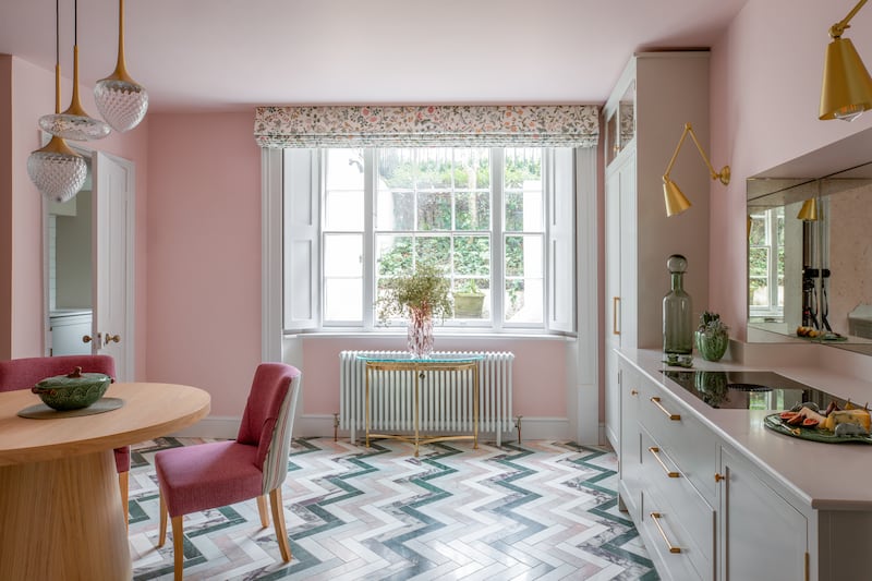
She also echoes shapes: so the outline of a mirror is picked up in a foot stool, the chevron inlay pattern on the kitchen floor (by Mandarin Stone, mandarinstone.com) in the angle of a light fitting, and the shape of the kitchen table in a half-table by the window. They all build up a sense of flow.
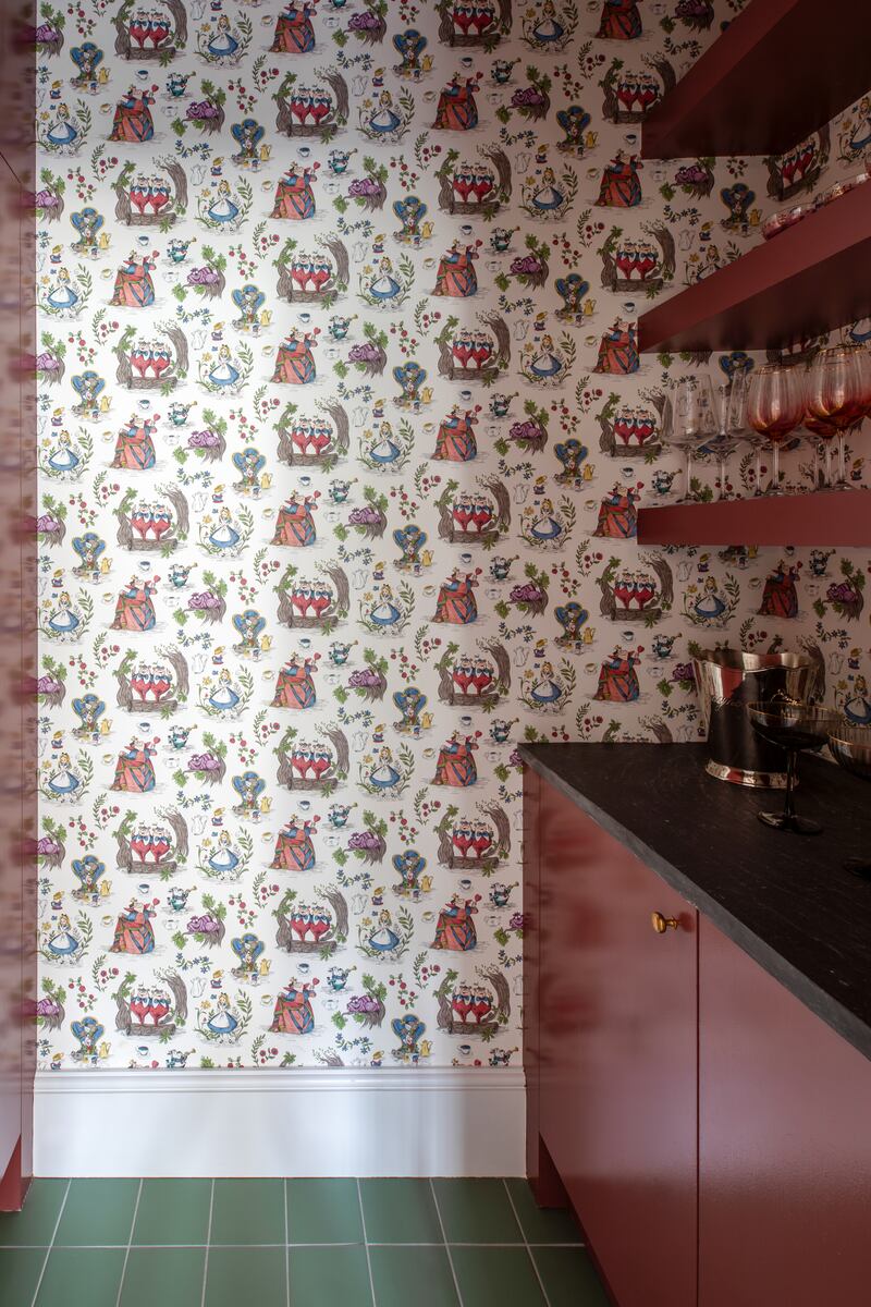
Even if you don’t have huge rooms, you can still have fun with colour and wild design by using the often unloved canvas of your downstairs loo. The smallest room can be an occasion for adventure in the right hands. Or find an alcove or adjacent space for a spot of feature wallpaper, as Ward has done in the kitchen with a panel by Osborne & Little (osborneandlittle.com), and in the little pantry-cocktail bar area, with a witty Alice in Wonderland paper, this time by Sanderson (sanderson.sandersondesigngroup.com).
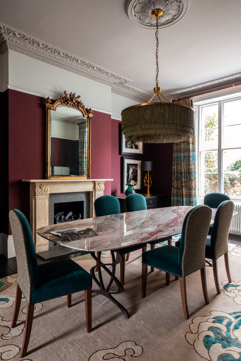
The wine-coloured paint here picks up both from the wallpaper and the kitchen floor, so it all hangs together. If you have a statement piece, or detail, it won’t scream too loudly if you let it echo.
Ward was mindful that the basement kitchen was on the dark side, and so she gave it a jazzy floor, and took out the island unit creating a sense of space, and making the kitchen table the centrepiece. “It needed an element of joyfulness,” she says. “So it’s not just a place to cook, you could be sitting there with family or hanging out late at night playing cards.”

Alongside their professional talents – Ward designed a great deal of the cabinetry, which was then made by Charlotte James furniture in Edinburgh – working with a designer also gives you access to their contacts. Ward sourced furniture from the likes of Tom Faulkner (tomfaulkner.co.uk) with his spectacular marble dining table, which became the starting point for the tones in that room. She also picked Spring, a funky cloud of a chair from Ireland’s own Bryan O’Sullivan Studio (bryanosullivan.com).
Another point to note, and make your own, is that you don’t have to rip everything out for a fresh start. The existing wardrobes in the master bedroom, which had been dark brown wood, were refaced with a Missoni paper to update them, and the walls are covered with a bouclé from Belgian company, Omexco (omexco.com). “I adore the feeling of sanctuary in my bedroom, every texture and tone is so gentle,” the owner says.
With so many elements, how does Ward know it’s all coming together? “It’s never static,” she says. “I’m eating, sleeping, living and dreaming it. When everything starts to pull together and the client trusts me, I know I’m there. It is a house bought by a woman, for a woman,” she says.
It certainly gives the sense of stepping into a new life with strength and confidence. “This house was a new chapter for me. As you can see by the colours, it has a very feminine vibe,” the owner says. “Collette really captured my personality.” That compliment was recently echoed by one of her friends. “A girl who I hadn’t met before said ‘you must know each other terribly well, because you’ve really got her’,” says Ward. “I was very pleased with that.”
- Sign up for push alerts and have the best news, analysis and comment delivered directly to your phone
- Find The Irish Times on WhatsApp and stay up to date
- Listen to our Inside Politics podcast for the best political chat and analysis


